At the beginning of the year, we released our brand new web building platform: PhotoBiz 8. Flexible, intuitive, and stylish, PhotoBiz 8 is a block-based, visual builder that lets you start with a designer-made template and easily customize to create your site your way.
We are always on the lookout for great sites, and this year we saw so many unique and wonderful designs! Even though each started as a template, these websites' clever builders have customized their design to showcase what makes their brands shine. There are tons of special touches and great ideas, so we just had to share!
Take a look at these great sites, and show us what you’ve built using PhotoBiz 8.
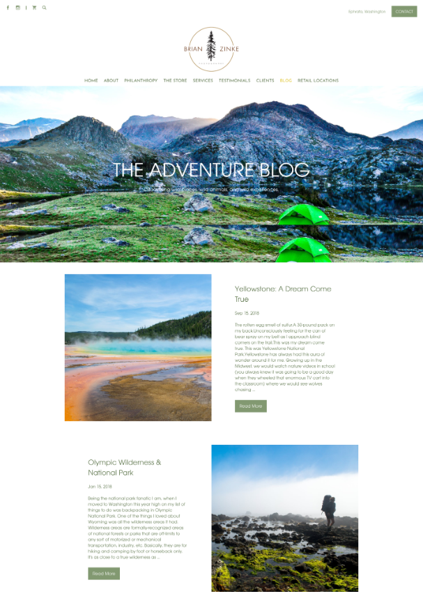
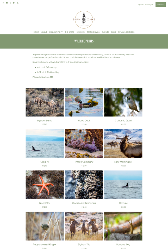
Brian Zinke's grid layouts and overlapping text and images make his work look like it comes straight from a high-end travel magazine. Everything is crisp, clean, and cool, with touches of natural colors bringing everything together perfectly. He is able to incorporate his photography, story, work, and mission with a full online store. Everything comes together in one place with one professional, cohesive look. Bravo!
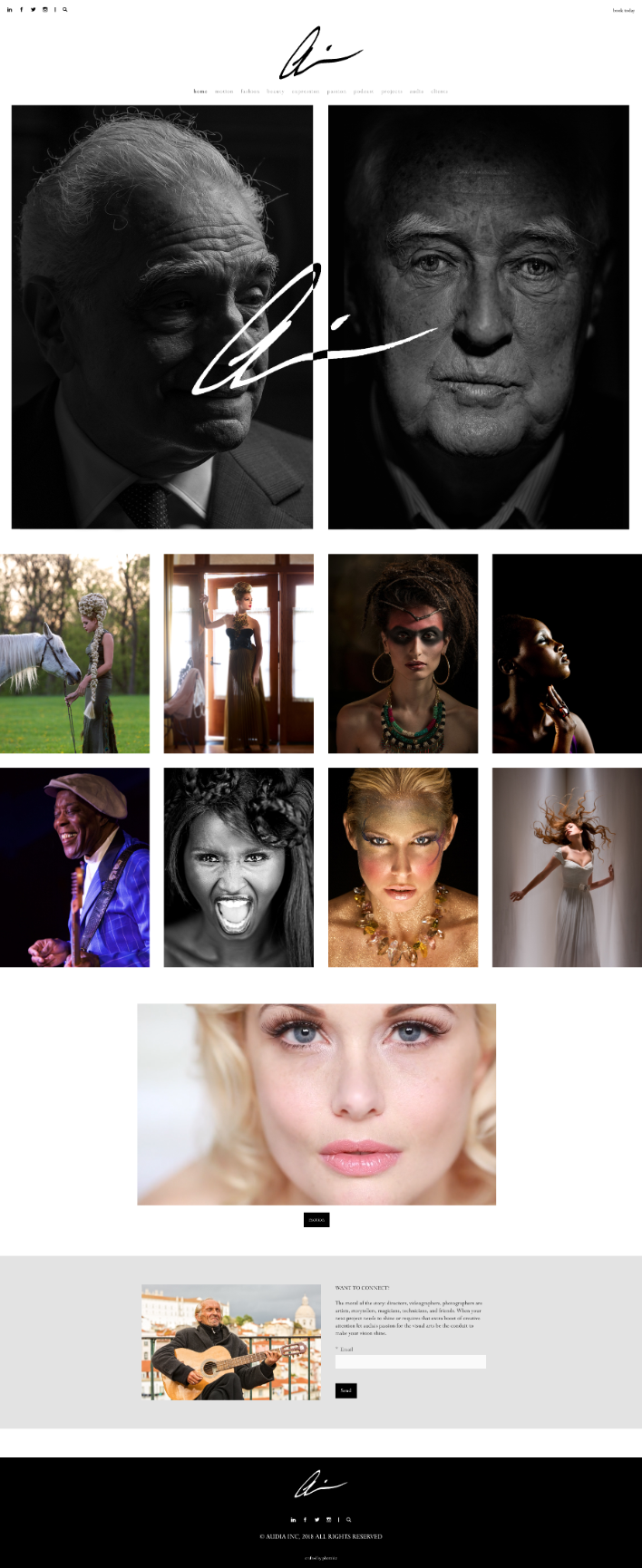
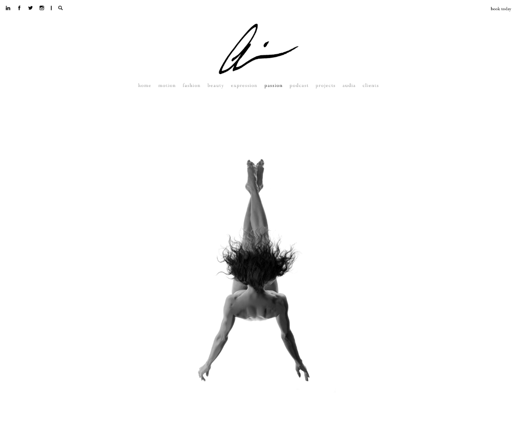
Light and airy, Audia gives evocative images space to breathe in an uncluttered, modern presentation. I particularly love how the logo floats over banners, and a blend of still and moving images captures the imagination. Simplicity of design lets the work speak for itself!
Did someone say COLOR!? Chele Jones captures your immediate attention with eye-popping images and colors to match. Banners and slideshows give movement and backgrounds lend just the right creative accent. Great job setting a funky, fresh mood and carrying it all the way through the journey!
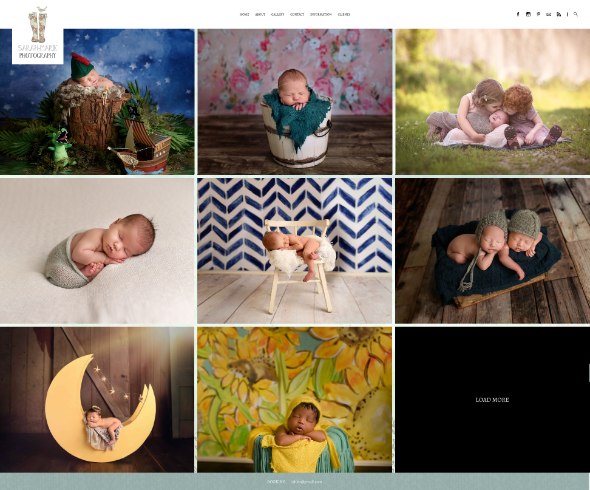
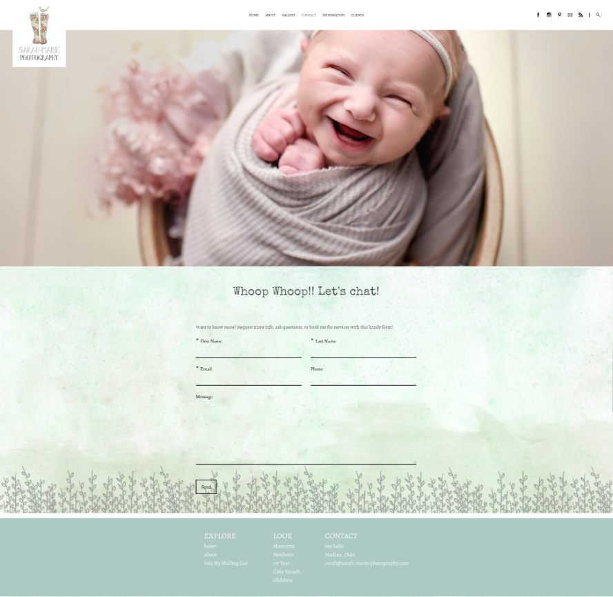
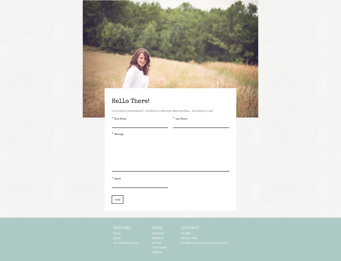
Sarah Marie's design is clean and simple, with a touch of whimsey. I love this font choice and all of the pops of color against muted greens... plus an occasional peek at a cartoony, grassy background. So cute! Sets the right tone and presentation for a dreamy newborn session, silly cake smash, or sweet maternity shoot. Lovely!
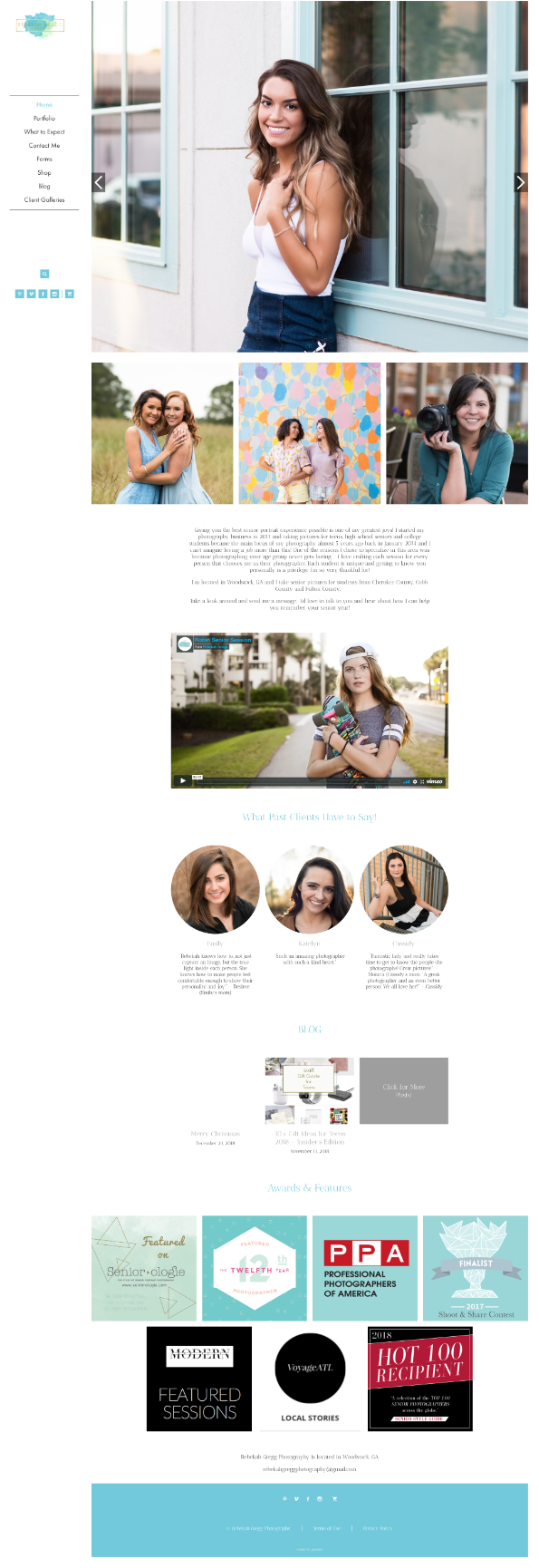
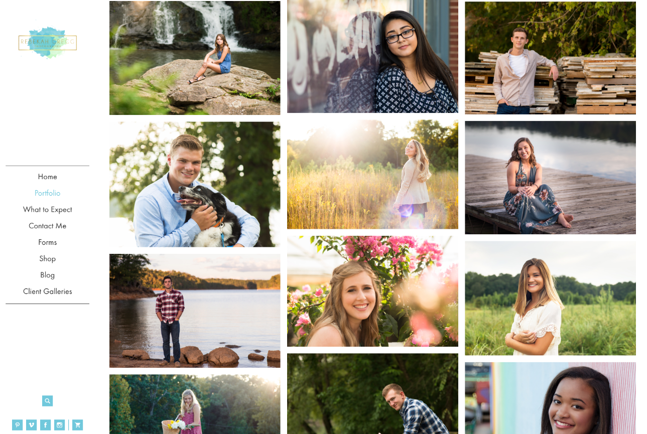
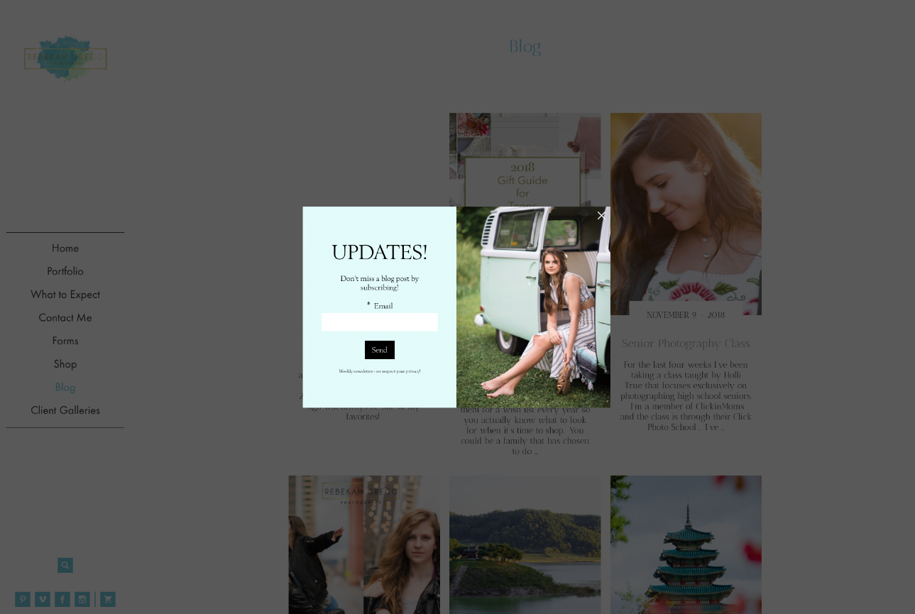
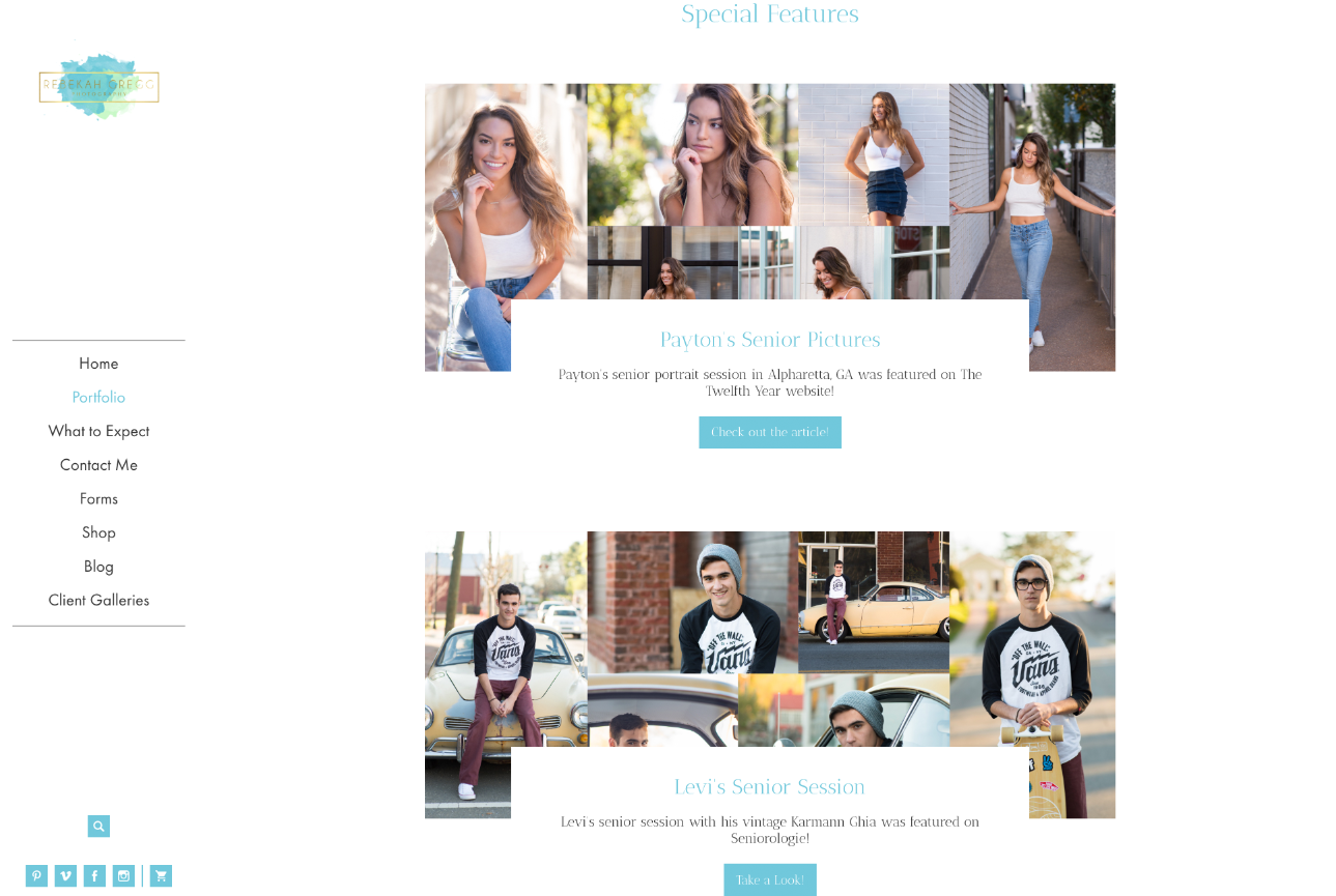
Left-hand menus have been very popular this year, and Rebekah Gregg's website is a brilliant example of just how lovely this layout can be. This design proves you can be fresh and professional while keeping it quirky and fun. A mix image shapes keep your eyes interested and wanting to see more. Plus, great use of a pop-up! Very classy and clean.
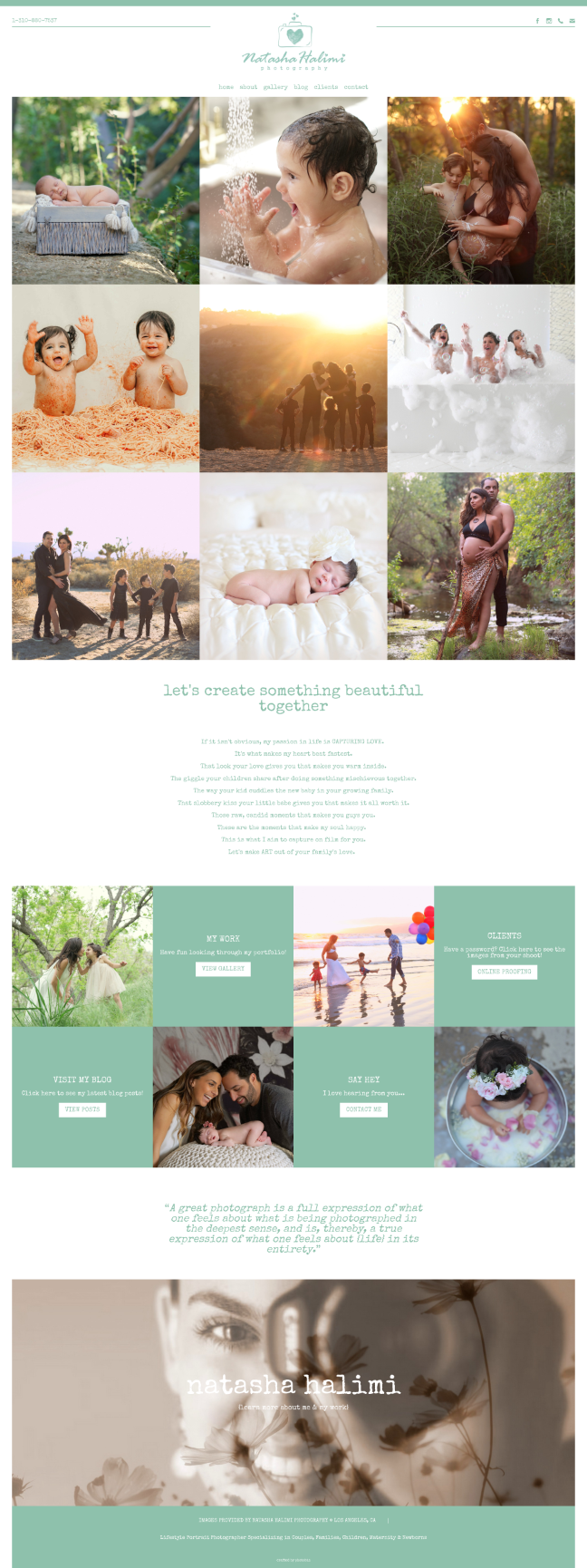
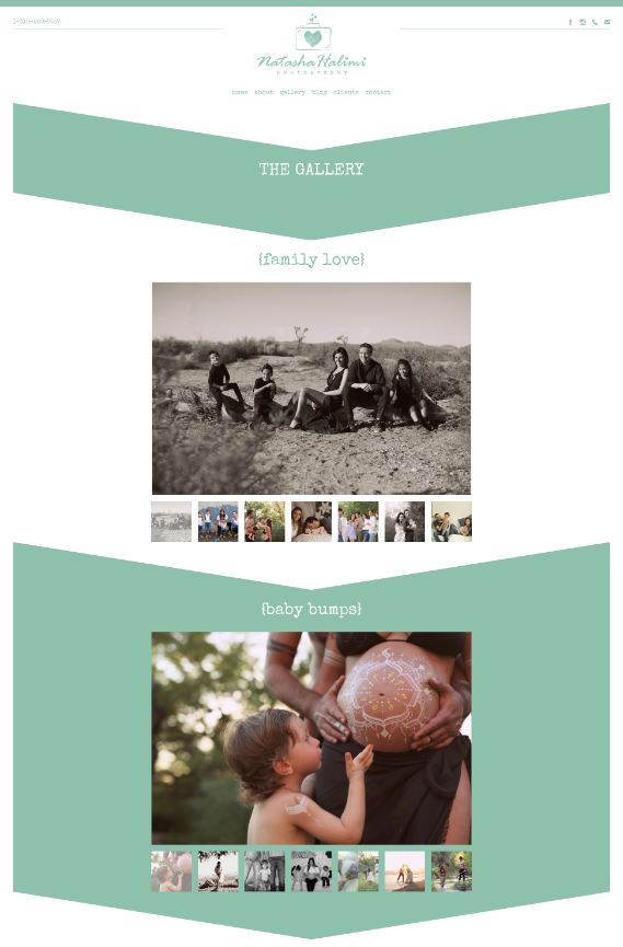
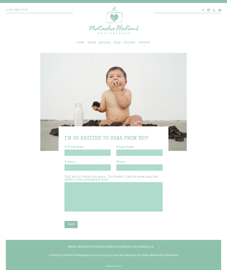
There's so many awesome things happening on Natasha Halimi's site. The color is consistent throughout and ties everything together while allowing the images to stand out. The logo is adorable, and we adore this clever use of dividers that lead visitors through different galleries. And this contact form? Perfection.
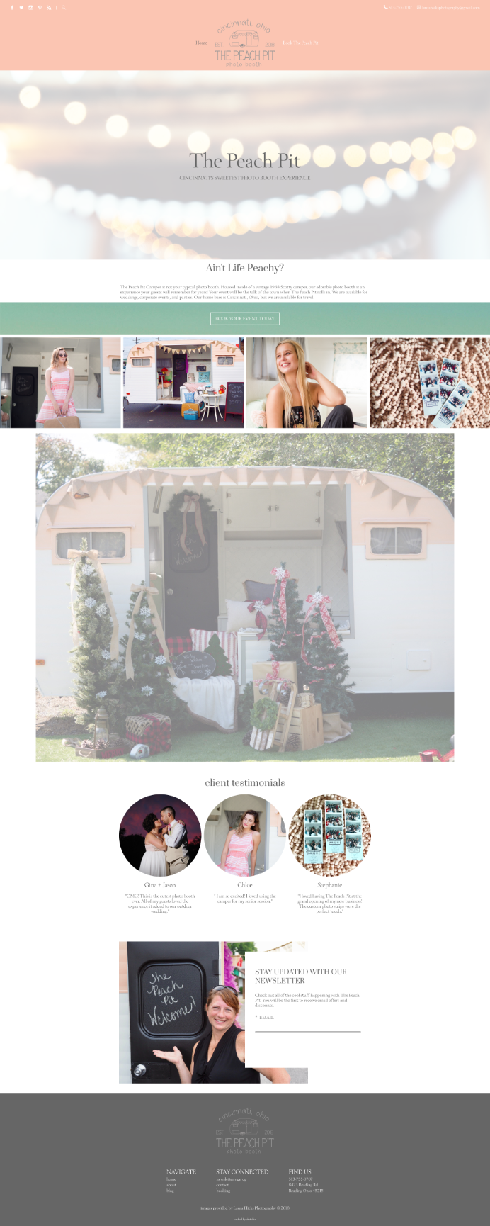
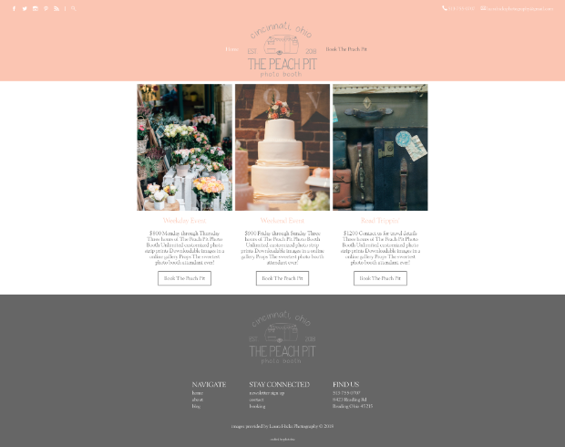
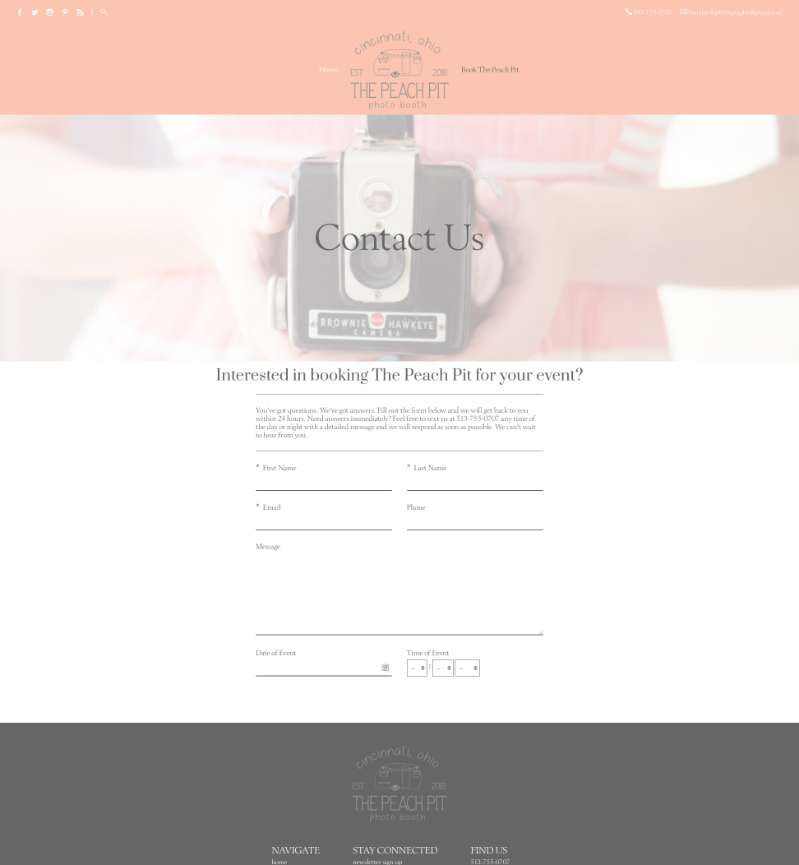
A compact little website, this design makes every pixel count. Peach Pit Photo Booth wows from the start with a great logo, cute colors, and awesome images. All the high notes are here – examples of work, how to book, pricing details, happy client testimonials, and how to get in touch. What more do you need? This site is short and sweet... and very effective.
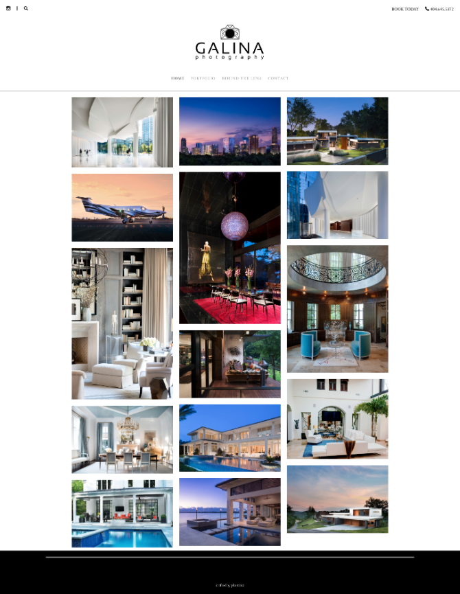
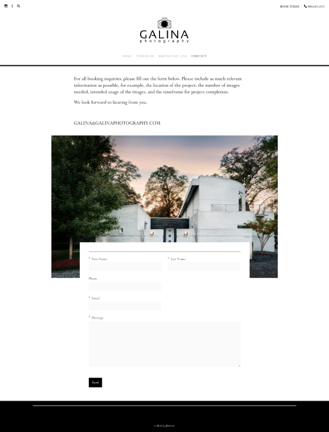
With Galina Photography's website, design imitates art. The layouts are solid, clean, structured, and perfectly suited for an architectural photography website. The grid layout offers chunky borders that let the images breathe and leads the viewer down the page. Here, the goal is clear. Get in touch! And this site accomplishes that goal with elegance and simplicity.






Leave a comment
0 Comments