Making your work stand out is vital for fine art photographers and artists. Choosing the right layouts can elevate your website, making it more attractive and user-friendly. Let's explore various layout options and how you can utilize them to showcase your work more effectively.
Employ Gallery-Like Presentations
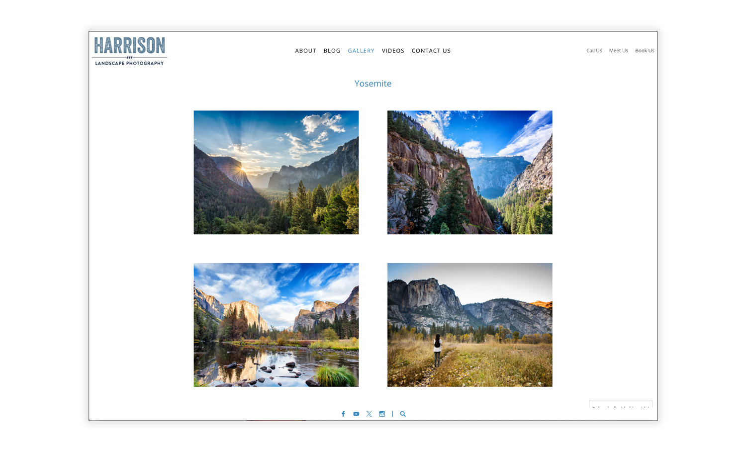
Design a gallery page that feels like walking through an art exhibit. Use overlapping elements and airy spacing to make your images pop and invite viewers to explore your work interactively.
Airy Spacing: Create a clean and uncluttered look that allows each piece to breathe, giving viewers a clear view of your art.
Overlapping Elements: Add depth and interest to your presentation, making your work look more dynamic and engaging.
Various Layout Patterns: Break away from conventional design norms with unique patterns that draw the viewer's eye and create visual interest.
Utilize Specific Layouts for Appealing Displays
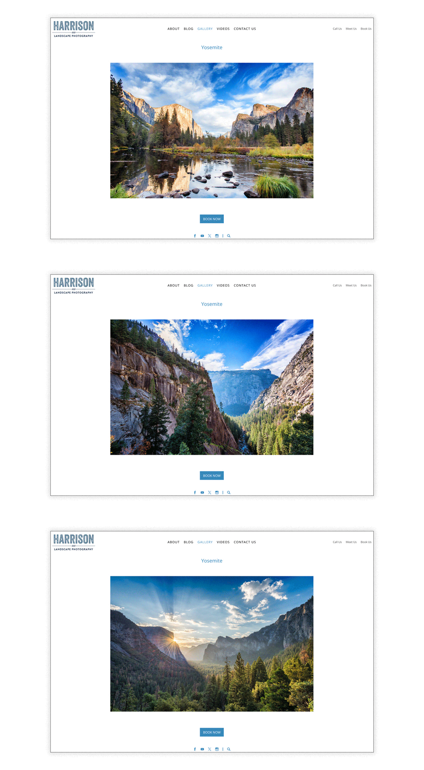
If you have a series of landscape photos from a particular shoot, use a landscape slideshow to create a seamless, engaging narrative. For individual portrait pieces, use the portrait layout to highlight each image distinctly.
Landscape Slideshows: Perfect for series or collections, a landscape slideshow allows you to display multiple images in a sequence, creating a dynamic viewing experience.
Portrait and Landscape Layouts: Select between portrait or landscape orientations based on the type of artwork. This flexibility ensures each piece is presented in its optimal format.
Combine Text and Image Layouts for a Magazine-Like Flair
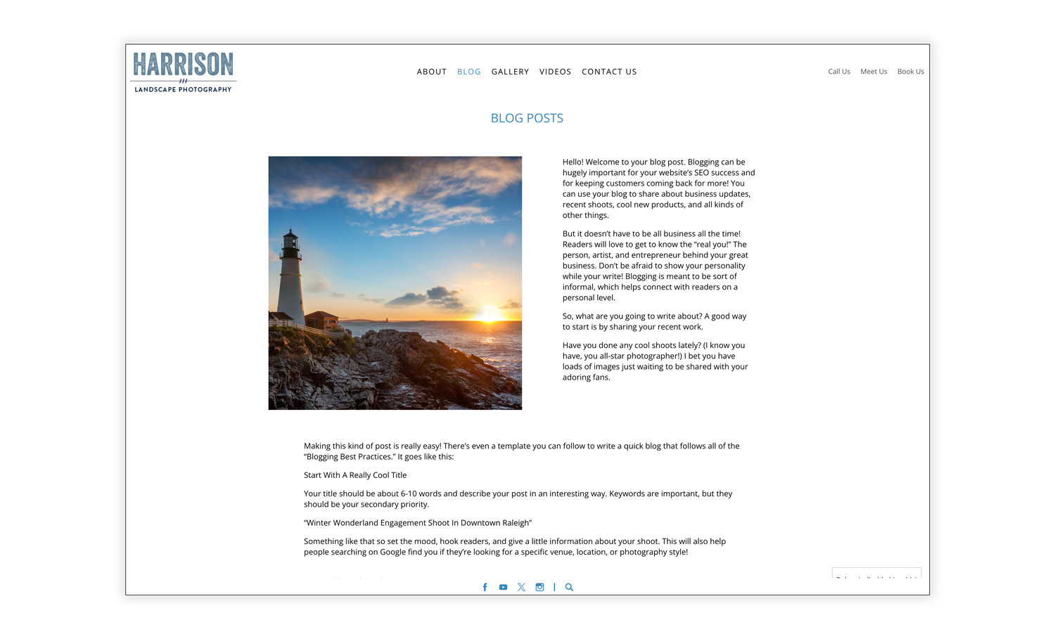
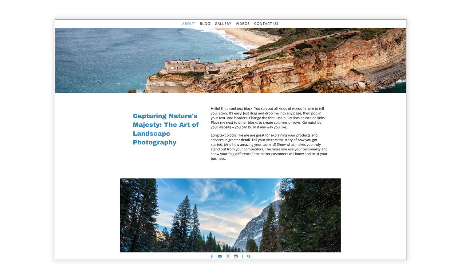
Craft a blog post or a portfolio page where your images are paired with descriptive text. Use these combinations to tell the story behind your work, making your website both informative and visually stunning.
Innovative Design Elements and Shapes: Break the monotony of traditional layouts and make your site visually appealing.
Enhances Appeal: Turn your website into a professional-looking digital magazine, combining images and descriptive text to create compelling narratives.
Text Layouts to Drive Story
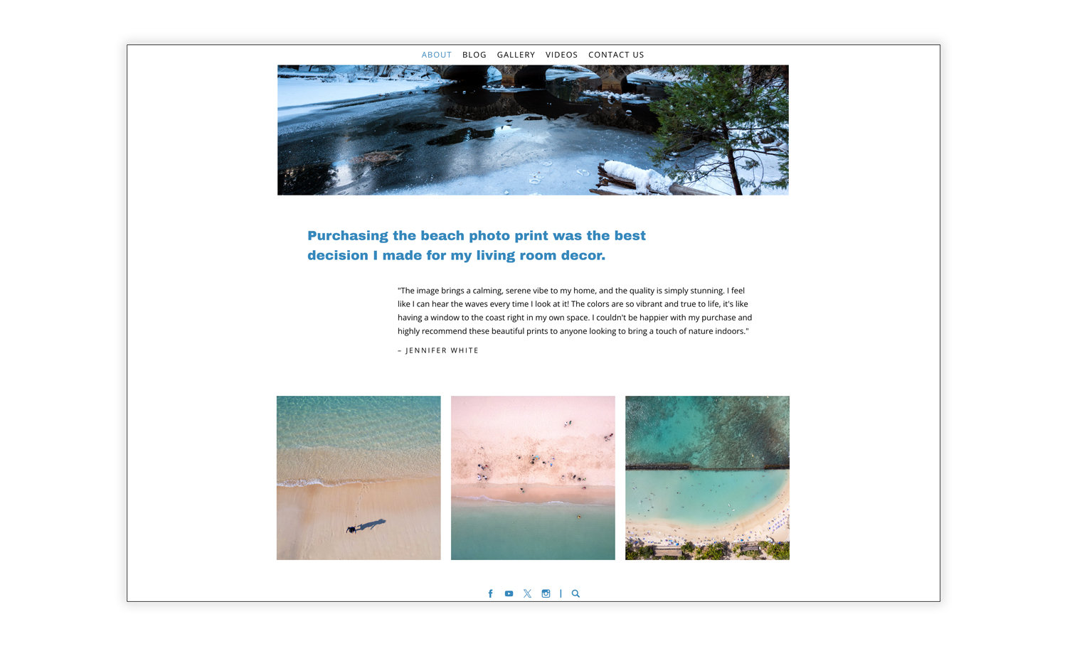
Use this type of layout to feature a glowing testimonial from a client or a powerful quote that encapsulates your artistic philosophy.
Highlights Quotes or Testimonials: Draw attention to significant text that can engage users.
Encourages Interaction: Makes key points stand out, encouraging viewers to read more.
Draws Attention: Perfect for sections that need to stand out.
Guides Through Content: Helps viewers navigate your page smoothly.
Optimize for Mobile Viewing
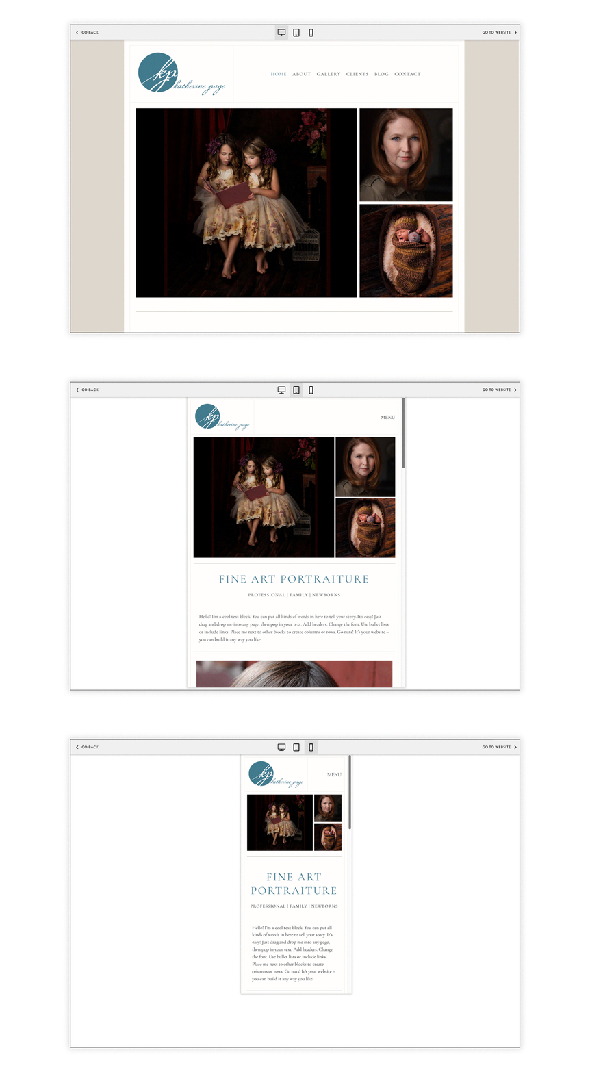
Test your website on various devices to ensure it looks great and functions well on all screen sizes. Simplify your navigation to make it easy for mobile users to find and view your work.
Responsive Design: Ensure your website is mobile-friendly. A responsive design adapts to different screen sizes, providing a consistent and enjoyable viewing experience on smartphones and tablets.
Simplified Navigation: Simplify your website's navigation for mobile users. Clear, concise menus and easy-to-tap buttons enhance usability.
By utilizing these layout options and strategies, fine art photographers and artists can create stunning online portfolios that captivate and inspire their audience. Embrace these design principles to showcase your work in the best light and enhance your online presence.
PhotoBiz's website layouts are a perfect fit for fine art photographers and artists. With a variety of customizable options designed to highlight your unique style and artistry, PhotoBiz can help you build a beautiful and professional online portfolio. Visit our website today to start creating your dream portfolio.





Leave a comment
2 Comments
Aug 21, 2024, 3:53:57 PM
PhotoBiz Growth Hub - just go to PhotoBiz.com/pricing !
Aug 8, 2024, 11:51:05 PM
Fiona Burch - Please send me information on how to do this and costs