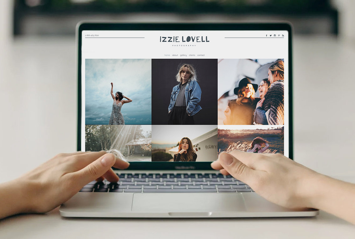
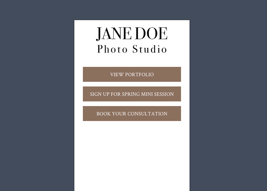
A homepage is meant to be the most captivating portion of a website. Not only is it a core page of a website, but it’s also your site's main page. It needs to draw people in to engage with you, tell customers the most important information about your business, including what products and/or services you provide, and it should describe how you can solve a problem for a customer.
If you’re a photographer, your homepage should highlight your best work. Visually share the wow factor your business can provide to create immediate interest in your services. But what else goes into making a great homepage design to engage visitors?
In this article, we’ll go over ways to use your homepage to engage customers, without going overboard.
Impactful first impression
Your homepage is a powerful tool to make a first impression. It is often the first thing people will see when they discover your business. So make it count. Feature an engaging photograph or banner image at the top of your homepage that showcases your best work. This should be “above the fold” meaning the first thing people see in their browser window before they scroll down the page.
So think about what is the first thing you want people to know about you? And what is the first action you want people to take? You should use your homepage banner to do just that, educate and engage people.
When people scroll below the fold, you should continue to educate and engage them. Use this space to tell people where you are located, what types of products and/or services you provide, and highlight information about why someone should select you, aka make your pitch.
If you’ve never had to pitch an idea, basically it comes down to a simple description of an idea or product. It’s your Shark Tank moment; can you convince someone to buy from you?
Simplification
There is something beautiful about simple, in fact, your customers will thank you (maybe not out loud) for providing clear, concise information to understand what you provide by delving further into your site. You’ve heard “less is more” — well it can be especially true for website homepages. I previously mentioned using your homepage as your pitch. Well, you have less than 60 seconds to engage people on your website. People don’t visit your website for very long. They hop from site to site looking for what they want or need. In fact, you have less than 15 seconds to engage people on your website according to Time Magazine.
With people using mobile devices more and more each year, we’re becoming accustomed to quick visual stimulations, scrolling through news feeds and Instagram posts faster and faster to get to engaging content. So your website has to not only be mobile but engaging and to the point.
That means using colors and fonts that are easy to read, and choosing ones that attract versus distract. Plus, selecting striking banner images that draw attention, with headlines that talk directly to customers. Your homepage needs to have simple navigation and make it easy for people to move further into your site. Give them clear options about how to learn more and engage with you.
As you think about the rest of your site (beyond your homepage), consider what you want people to learn and if you can communicate everything your clients need to know in 10 pages or less. Be direct, give people options, and guide them through your site to the point of making a purchase or contacting you for more information.
Homepage flow
Planning the layout of your homepage should be the first thing you focus on. It’s not enough to just flood information onto a page, it is important that there is a rhythm to it - a flow. What do I mean by a flow? Flow is an invisible guide that draws people's eyes through a page. This flow is purposely there to help guide customers to what you want them to know about your business.
When creating a thought-out flow, think of it as designing a map. An easy way to do that is by making an outline. If I were to make a flow for a homepage, it might look like this:
-
Menu & Logo: Show people who you are and where they can go to learn additional information.
-
What: Banner with a short important message and a call to action that drives people to a featured service or product.
-
Who & Where: Important details about your business expertise and the geographic area you serve.
-
How: Explain how you make a difference for your customers.
-
Why: Reasons why a customer should choose you — show accolades or testimonials.
-
When: A form for contacting you. Collect data about your customers and possibly allow people to set up a time for an appointment.
-
Footer: Links to extra pages and contact information that are not displayed in the main navigation.
The content on your homepage should include a combination of words and images. You can have awards show your proof of expertise, your images showing your quality of work, and a form to allow people to book an appointment. The key is making it easy for a customer to quickly learn about and understand your business.
The PhotoBiz homepage has gone through many looks and designs over the years. We are continually reviewing metrics and learning how to make it a more effective homepage, such as by clearly describing what we do before people scroll. Looking back, at one point maybe we had too much information on the homepage. Now we have an organized flow of pages that people can access for a deeper explanation of the platform and what we provide.
Know when to edit yourself
We already discussed the importance of simplicity and focus. This is important to remember when reviewing the content on your homepage. It can be tempting to create a homepage with an endless scroll or single-page website, but that can be harmful to a site. Beyond SEO purposes, really long homepages start to make the site weigh disproportionally. The homepage should draw people in to learn more on other pages of your site, it shouldn’t be the page with the most words and images.
If you have a homepage with over 1000 words, 50+ images, testimonials, statements on why they should choose you, multiple signup forms, and an excuse to keyword stuff more about what you do, you probably need to edit that back a bit because it can overwhelm customers and make them less likely to engage with you.
Too much content can overload or overwhelm and cause a customer to be disinterested in your business. Name off the top of your head some of your favorite websites you visit to purchase products, they might not be similar types of businesses, but think about what their homepages have in common. They are likely short and clever and provide directions on what they want you to do.
They link to products, showcase sales, and focus on why you need them. Your homepage should do just that. Get people interested, and provide calls to action so they go deeper into your website to learn about exactly what they are searching for. You should not cram it all on the homepage. Take a step back and look at your homepage from your customer’s perspective, and then edit yourself.
How to end your homepage
Do you know how run-on sentences seem to keep going and sometimes just end with an inconclusive thought? Ending your website without appropriate flow can feel like a run-on sentence that ends abruptly.
At the bottom or end of your homepage, it is important to include an option to take the next step or contact you (through a form).
If someone scrolls to the end and there is no direction on what to do next or how to further engage, we call this a dead end. You don’t want your homepage to be a dead-end, it should be the beginning of a conversation. Think about what you want people to do next and make it easy for them to do that. Do you want them to visit a specific page? Put a call to action button that links to that page. Want them to contact you? Place a form there. Make it easy for them to take that next step.
With great flow on your homepage (and each of the pages on your site), you can guide people to go further into your site instead of bouncing.
Conclusion
Building the homepage of a website is critical. It is what people will often see first, so you need to make a lasting impression. Create a simple flow to encourage customers to engage with your website in a purposeful way. Keep your homepage as short and focused (like a highlight reel) as you can, and use your internal pages to provide longer, more in-depth content.
Want assistance creating a great homepage? Give us a call at 866.463.7620. Our support team can provide tips and how-to information. Or if you want us to build it for you, our Pro Services team can craft a homepage design that tells your story.
Once your homepage is done, then it’s time to tackle the other core pages of your website. Check out our article about core pages and why you should focus on getting these right before you tackle other pages.


Leave a comment
0 Comments