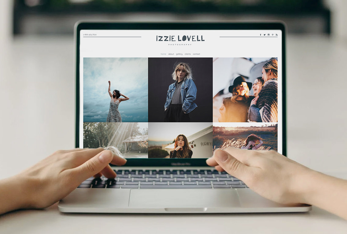
The style of an art gallery website can range widely in style, the key is having a place to display and sell your work. PhotoBiz gives you tons of options to highlight your art and create online galleries to turn your portfolio into a virtual art gallery.
So how do you build an artist gallery website? In this blog post, we’ll show you how easy it is to choose a template and personalize it to meet your needs.
Choosing a template
Which template you choose, depends on you and your preferences. There is no “right” template. Any of PhotoBiz’s website templates can be customized to meet your goals. It really comes down to your preferences in style and what will work best for your customers.
There are three variables to look at when selecting a website template that's right for you and your business. Focus on the menu and logo placement (top, bottom, left, or right), and if the website is compact or full-width (does it have borders, or do the images extend to the “edge” of the screen). The colors, fonts, patterns, and content within the templates can all be modified or removed but the menu and logo placement, and width of the template can not.
Once you select a template, that’s when the fun begins. You can modify the colors, fonts, spacing, and blocks within the site to suit your needs and goals. Today’s I’m going to show you two ways you can make an art gallery website using a single template so you can see how versatile the templates truly are. I’ll design the Adams template in two ways: traditional and more modern. Here is the template “out of the box” so you can see where we started from.
Homepage design
Right from the start, the Adams template has an editorial and traditional look. By using a serif font, large spacing, and a square layout for images throughout it has a unique voice. Below you’ll see I’ve modified the colors and inserted traditional landscapes and portraiture art. The website now has a more warm feeling. It feels professional and easy to navigate, which for user experience is key.
To make this template more Avante Garde or focused on contemporary art, I can replace the warm colors with cool colors and select a san serif font (instead of serif). This design may feel cold to some but it is very expressive. It uses space and color as part of the focal point.
All of the pages of your site, like your about and contact page, would follow suit as a result of the template settings. It is important for your site and brand to feel cohesive.
Gallery design
Your gallery design is where you can be adventurous or standardize your styling. Again, it comes down to style and preference. Adams original gallery design uses square shapes and allows space to include words on the page (good for SEO). This is great for a compact look, but if you truly want to make a gallery image focused with no cropping to see the full work, I recommend using the pinboard layout (in the image block settings). This the purest experience you can create for a gallery. Depending on your style you can place all horizontal images together and all verticals images together making the gallery more formal.
If you are looking for a more abstract expression, you can use a pinboard with vertical and horizontal together and even do large image call out sections to creatively express the energy from the art.
Storefront options
When it comes to selling your art, having an online storefront is important. And building that online storefront with PhotoBiz is simple. When setting up an online store, whether your site features a traditional or contemporary style, I recommend making a square version of your artwork (place the art on a square background), so it won't be cropped when people look at your work for sale.
With a PhotoBiz online store, you can sell both your physical artwork and digital versions (if you so choose). The main thing with a store is to remember to make it easy for people to navigate and purchase from. One way PhotoBiz makes it easy for you to organize your art you sell online is with product options. For example, if you sell something in multiple sizes or with multiple frame choices, you can allow people to choose those options.
Plus, we have an inventory system built right in so that you can keep track of how many of each product are available and prevent your customers from purchasing more of a product than you have. The inventory system can alert both you and your customers when something is low or out of stock
If you are selling a print with limited availability, you can add the amount you have in stock for your record-keeping and a low or out-of-stock alert will display on the front end of your store, based on your settings. This is a great way to market your work so customers won’t have FOMO, and can recognize how exclusive and in-demand your work is.
Regardless of the style you choose for your homepage and your storefront pages, I recommend that page has a white background. This clean space makes your products stand out and not get lost in or compete with the site’s color or design.
You have a variety of tools and options when it comes to designing your website with PhotoBiz. You can use a website template design right “out of the box” or you can personalize it to meet your needs as an artist. It's really up to you. The key thing to focus on when building a website is what type of image or message you are trying to express to your customers (current and potential). Color, space, and font do a lot of this work, the template just holds the content and can be modified till you find your desired look.
PhotoBiz gives you the resources to really make each website template your own, so much so that any template can be used to represent any type of business. Plus with the benefit of being able to change your look with just a few clicks, you can change up your look in no time. We try to make it easy so you can quickly get up and running (and be profitable).
Do you need help getting started? Give us a call at 866.463.7620. We'd be happy to help you get your website up and running.


Leave a comment
0 Comments