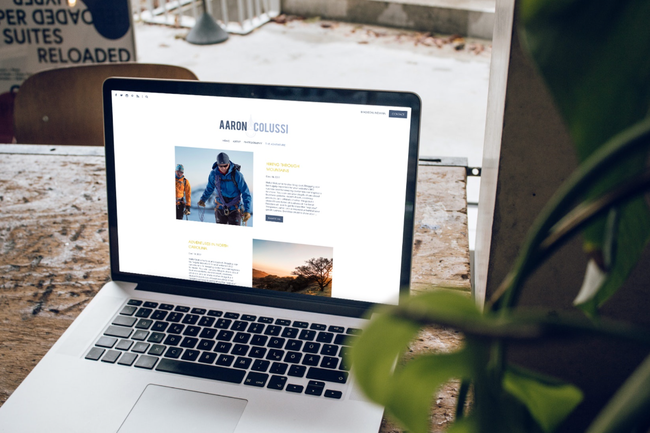
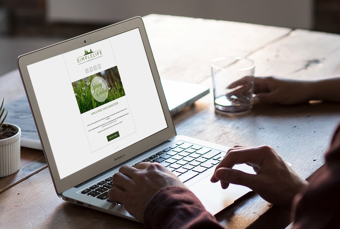
Last week we covered how to make registrations on your site. Now let’s promote them!
We’re going to build some landing pages that we can share on social media to build up buzz.
These pages will also be indexed in search engines. That means people looking for summer photography sessions on Google or Bing can take advantage for your sale, too! All that extra traffic to your site will also help your overall SEO.
Let’s get started!
First, click on Marketing in your control panel. We can create emails and landing pages using the CAMPAIGN BUILDER.
Pick Your Template
You can create an email marketing campaign or landing page by selecting NEW. Then you’ll see a bunch of templates you can choose from to start your campaign.
I’m going to promote my summer sale, and I really like this Summer Sessions template. I’ll pick that one.
Build Your Campaign
The drag & drop builder loads up with placeholder content that you can easily edit.
Pop in your logo, change up the text, and add images to personalize your campaign. You can move around blocks or add more from the “block bank” at the bottom.
That sample image looks nice... but you should show off your own photography. Let's pop in a new image. I’m also adding a section to hype my special promo code! That’ll make the offer really enticing.
Write A Strong Call To Action
Perhaps the most important part of your landing page is the Call To Action.
The secret to creating a great call to action is say the next step clearly and explain what benefit the customer gets in 6 or so words. (Bonus points if you include a sense or urgency!)
So what is it you want people to do once they’ve seen your page? Go on and ask them!
Link Up Your Social Media
Click into the social media block to set up your links. Link to everywhere people can find your business online – it’s never a bad time to get more followers!
If this is your first campaign, you can configure your social media accounts by clicking into the block. Once you do, it’ll save them for all your future campaigns.
Click ADD NEW, select the social site, and enter your URL. Rinse & repeat until you’re done!
Customize Your Colors & Styling
Now let’s make your campaign look a little more “you.”
Each template comes pre-styled with colors, borders, and button types that you can tweak to match your brand. If you click on the paintbrush icon, you can see all kinds of styling options to change the look your template elements.
I’m changing my buttons to square, icons to square light, and my button text color to white.
You can check how your campaign will look at any time by clicking the URL below the campaign title (it’s next to the little box with an arrow).
Name Your Campaign & Share Online!
All done! (Easy, right?) Now it’s time to share.
Give your campaign a friendly URL. In your settings (the little gear icon), you can name your campaign anything you like. It will change the URL to match.
Now you can use that URL to send directly to your friends, embed on another page, or use on social media.
Click SHARE to see your options and send away!
Pat yourself on the back! You’ve just built a landing page for your summer sale that will help you land lots of new and repeat business. And the best part is that it didn’t cost you a dime.
Need help or inspiration in building your own campaign? We can help!
Ring us up at 866.463.7620 and we can help you put together a cool campaign for your business.


Leave a comment
0 Comments