This week marks the start of spring! And what better way to celebrate than with some colorful new templates we harvested straight from the design orchard.
Coming in hot are Lenox Hill, Ocean Avenue, Winston and Hagerstown. Each has a bunch of cool features I think you're really going to love.
Lenox Hill
Lenox Hill uses a vertically stacked menu (like its friend NYC), but with some notable differences. Here, your logo and menu labels are boxed, and the active page is indicated by a funky highlight color.
Our main body of content is also now full-screen, and images are surrounded by nice, wide borders. This gives images room to breathe and do their own fabulous thing.
Huge thank you to Brooke Daniels Photography for lending us her images for the Ocean Avenue sample!
Ocean Avenue
Bright and beautiful, Ocean Avenue is just lovely with the airy, floral portraiture of KSS Photography.
The anchored left vertical menu gives space for consistent branding, positioning the logo large and in-frame at all times. Social media icons are prominent, too, seamlessly encouraging visitors to flow from your portfolio to your social accounts.
Continuing the theme of "seamlessness," Ocean Avenue's image galleries sport no border between images, reinforcing a fluid, contemporary look.
Winston
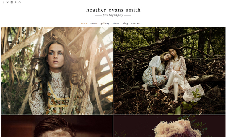
Winston features delicate micro-borders, which bridge the gap (so to speak) between Lenox Hill's wide image frames and Ocean Ave's non-existent ones. These ultra-fine borders pair so nicely with the moody and finely-detailed work of Heather Evans Smith.
Winston has social media icons featured at both the top and bottom of the design. Winston also includes a wide header with a centered logo and sticky top menu.
This template is designed for simplicity and elegance, leaving nothing between the viewer, your images, and the immersive story that they tell.
Hagerstown
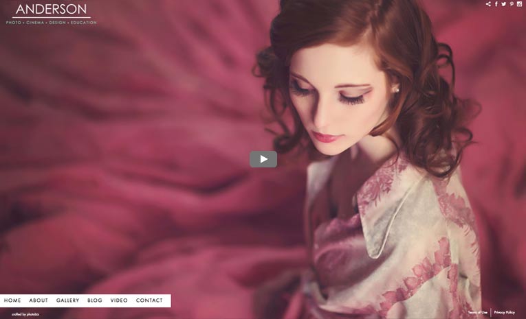
Want a full-screen video homepage? Hagerstown is ready to go. Your video loads up full-width and all of your branding & mechanical elements are neatly tucked away so they don't distract from the client's viewing experience.
The menu is a new "peek-a-boo" style that slips in from the left and hovers just above an invisible footer. It gives the template an unexpected dimensionality that is surprising and interesting.
As for branding, your logo and social media icons are prominently displayed in the top corners of the design. Hagerstown does a nice job of taking a lot of visual information and displaying it in a way that feels natural.
Thank you to Melanie Anderson for letting us feature her awesome video and portrait work on the new Hagerstown sample!
All of these templates are available and ready to use FREE in your site builder.
Wondering how your site would look with these designs? Here's how to try on and change a template!
Take a look around our newest templates:
Lenox Hill ~ Ocean Avenue
Hagerstown ~ Winston
All 2017 Templates:


Leave a comment
0 Comments