Building with our website builder is easy. As easy as building with blocks.
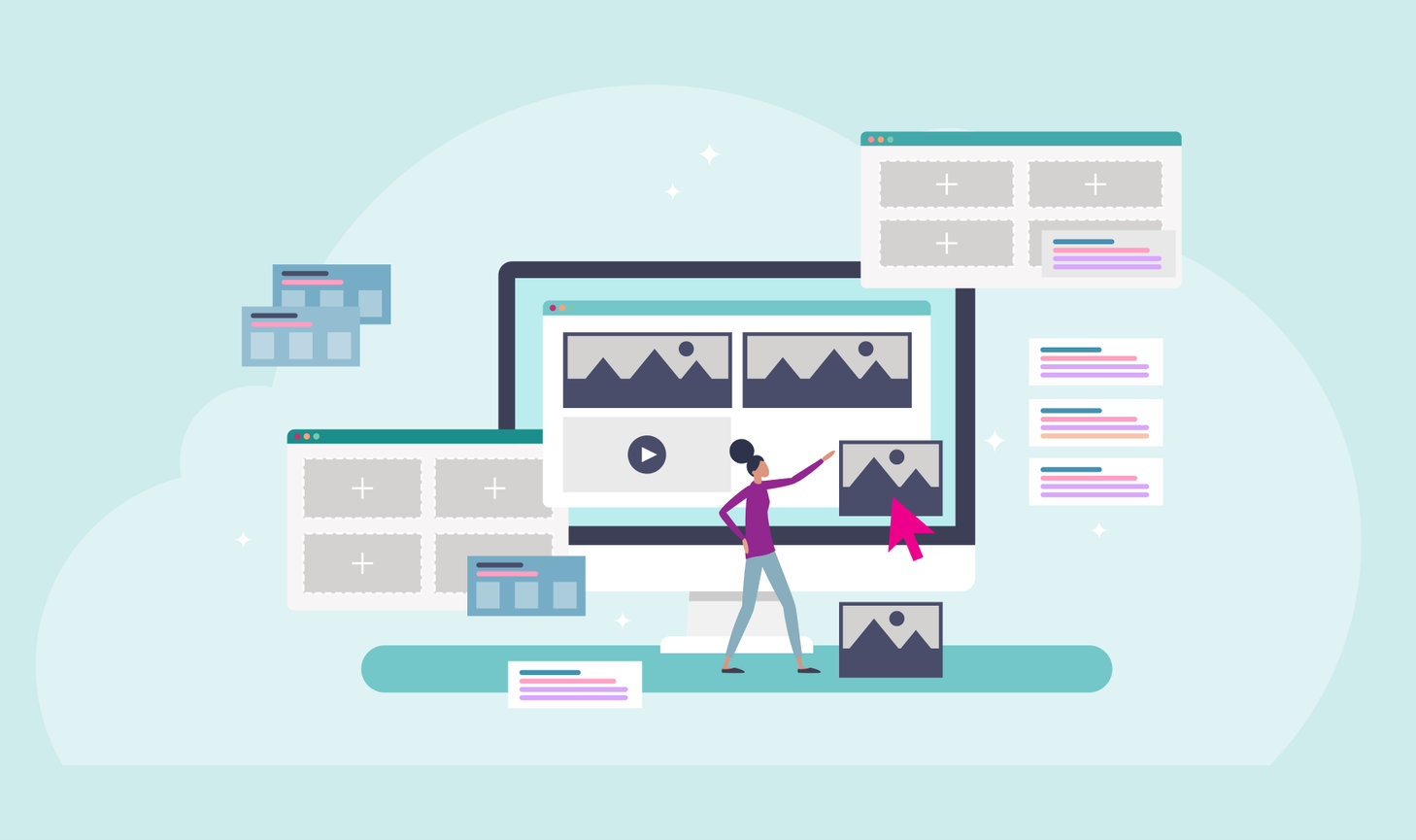
In this article, we’ll break down the differences between the types of blocks you can use to build your website including banner, image, image + text, and list item blocks. This will help you learn how they can be used, and when it is best to use each type of block.
Jump to a section:
Banner Block
Image Block
Text + Image Block
List Item Block
Banner block
The banner block is the most eye-catching block! It is also the most straightforward image-related block. It is best used as a header or page break style image. You can add text or a button on top of the image to help make it stand out amongst the page.
The image can stretch the full width of a page, meaning it takes up the entire browser's frame, and you can choose the height (e.g., full screen, medium, short, thin). What size you choose will depend on the aesthetics of your page and the content you’re sharing.
Here are the styling options available for a standard banner block.
What does image bleed mean?
The term bleed is traditionally a print reference, to mean something prints off the edge of the page. In this case, an image block with bleed means it fills the full space without any border. With a standard block, your images will bleed off the block. For example, if you have a horizontal image, it will completely fill the block (the exact size of the block depends on the website visitor's screen size). The image may be cropped slightly depending on the size it displays so that it always fills the block.
No crop banner options
If you want to display your full image without any cropping, you can also choose from our no crop layout options. Again this displays the image inside the banner block container, but instead of cropping the image to fill the full space, it scales the full image to fit inside the container.
You can choose from a variety of no crop sizes including full screen, medium, short, and thin. The difference between these options is the height of the banner that your image displays inside. If the image you load into a no-crop banner is a different size than the container, the website background will be visible. Meaning, you will see the website background color underneath your image, since the image doesn’t fill the full space.
Another layout option you have with the banner block is a carousel layout that automatically scrolls through a collection of images. You can add both horizontal and vertical images to this layout, they will be scaled to fit and may get slightly cropped. You may even see parts of multiple images at the same time as the images scroll. This option also has variations including full screen and medium.
Banner blocks also have additional styling options like adding text, buttons, and parallax scrolling.
You can add these options in the styling section of the banner. To add text and/or a button to a banner image, click the image you want to modify.
In this menu section, you can add text, a button (clickable link), replace the image (without losing the text or button settings), and modify the image's focal point.
What is a focal point?
The focal point is a setting that allows you to identify the subject or focus of an image. This is particularly helpful when displaying an image in a container that may get cropped. You can click on the bullseye icon and reposition it as you like to identify what should always be seen (or the focal point of the image).
Once you have the banner set up the way you like, you can save it and then adjust text colors and more for the block.
Mobile banner option
Want to choose how your banners look on mobile? Banner blocks have mobile image settings. The banners are naturally mobile responsive, but if you’d like to have even further control over the mobile experience of a particular banner, you can! You can add mobile images to a banner and they will display on mobile devices.
You can add text and button links to these mobile images as well. You can choose to have the information mirror the full-size banner or make it completely different, it’s up to you.
Tip
We recommend using vertical images for mobile banner images. This option is really nice to make your site experience sleek on phones.
Banner blocks are a really great way to highlight content you want to stand out on your site. When used at the top of your website, the banner is typically the first thing a customer sees and can be a great way to highlight a promotion or service. Hint, hint, include a call-to-action with a button to drive customers to click to learn more.
Image block
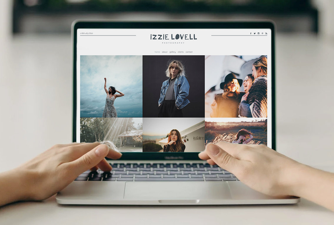
When you want to show off a collection of images on your website, the image block is what you’ll want to use! You can use this block for image galleries. There are a number of settings in an image block, such as how many images to display in each column and row and if you want to display all your images or show a “load more” button.
What is a last item link?
You can help protect your site’s loading speed, by displaying a certain number of images at first, and then showing a “load more” button for people to click.
There are layout options in image blocks. Including horizontal and vertical layouts, and ones with shapes like circles. You can also choose options for stacking large images, collage options for a unique display, and a pinboard layout to display both vertical and horizontal images together. If you’d prefer a slideshow that customers can click through, you can do that with an image block too! This is great for more condensed page options.
While images are worth a thousand words, you can also incorporate text into image blocks. There are options to add text to each image, overlay text on the image, display text with rollover effects, and others that list the text on top or underneath the image. Each layout has its own preference.
You also have the option to modify additional settings for images such as spacing and flushing (meaning if it runs to the edge of the template and browser or if it is more compact with space on either side).
You have a lot of creative control on how to display the images in an image block! You can use it to highlight your work in a gallery, show off a single image, or feature a collage within a page. You can choose the style that is best for you!
Tip
If you want to use images with text and buttons on top, check out the List Item Block.
Text + image block
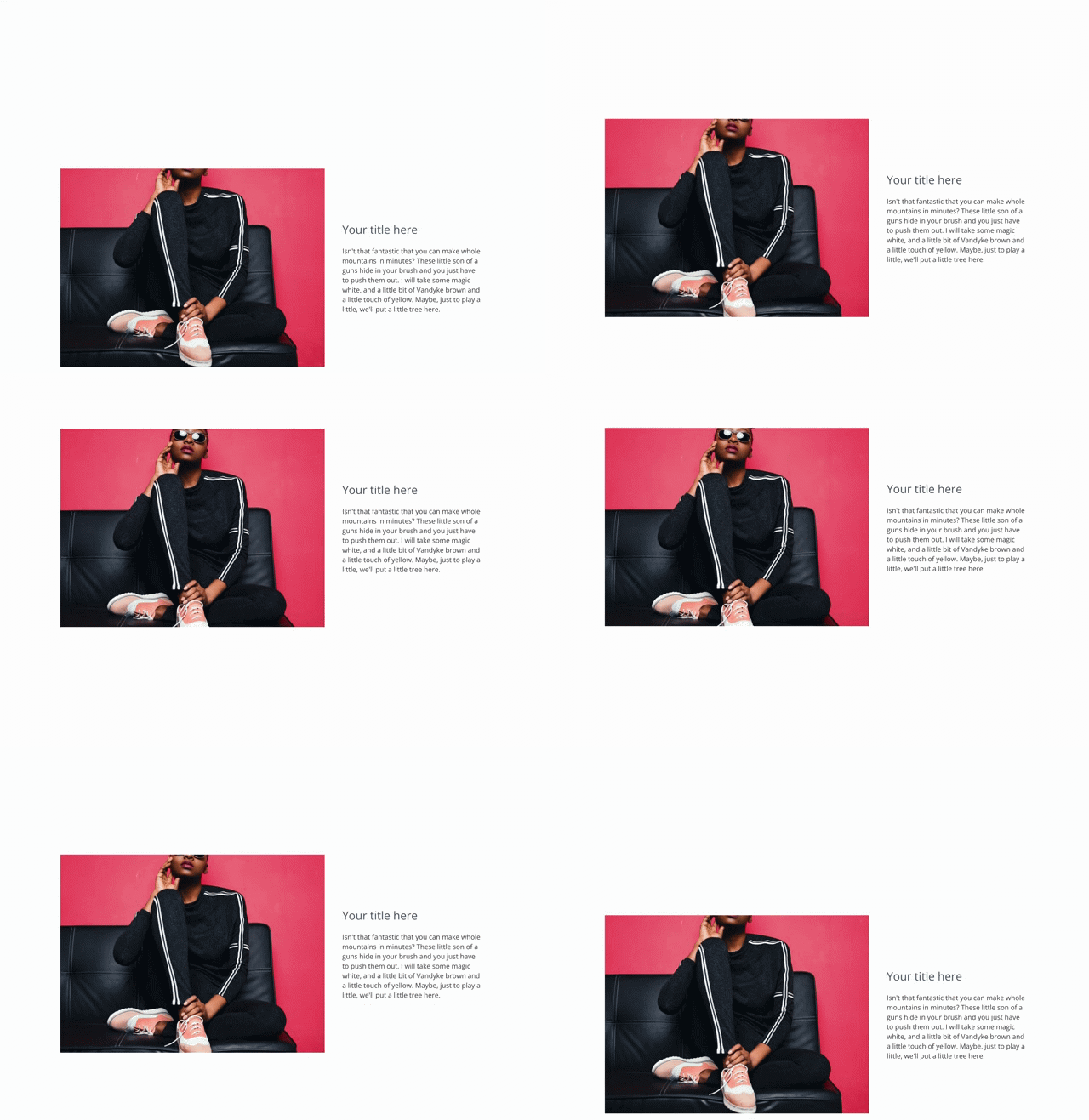
Text + image blocks are a great way to display long text descriptions or paragraphs of information paired with an image. There are many stylish ways to display the text and images.
You can display text and an image next to each other and choose which side they are displayed on (left or right).
Or you can select from multiple options that overlay text on top of the image. There are even some options with distinct shapes.
And lastly, you have parallax options that make it appear that the image is moving as you scroll but the text stays fixed.
What is a parallax image or banner?
Parallax is a mathematical way of saying layer movement. When you enable or choose layouts with parallax as you scroll or move up or down the page, the image will move as if it is layered behind the site. This adds depth, and a distinct look.
With this option on, the image will scale inside the block’s container, so you may need to adjust the focal point. Scaling the image helps create space for the movement.
 Parallax scrolling enabled on text + image block
We recommend using image + text blocks to add depth and interest to your pages. They can help with your page flow, by breaking up text or image displays. They can be used on nearly any page of your website including your homepage, about page, and other informational pages that highlight details about your business.
List item block
List item blocks are very versatile. They are great to highlight snippets of information and organized content. They can include images, text, video, and buttons. And there are a number of layouts to choose from.
If you may want to display an image with text next to a video link option, a list item block is great for that!
Or if you want to display text content in a few columns with a call to action button at the end, try a list item block!
You can also use list item blocks to display images or videos in a long-form list (not side by side) which is great for informational pages. It is really up to you and how you want your website to look and function.
We recommend using the list item block throughout your website! It is great to highlight information on your homepage, and display details on informational pages like investment pages, plus it is perfect for displaying testimonials, and a great option for video gallery pages.
There are tons of options and settings for each image block style. Which image blocks you will choose to build your website really comes down to how you would like the site to flow and function. These image style blocks are great to create excitement, showcase your work, and help people learn about your business.
Things to be aware of when designing with image blocks:
-
Banners are generally landscape/horizontal shapes intended to fit computer monitors and browser styles in a ratio of 16:9. Your images will fill out the block's container size, unless you choose a no-crop style.
-
When selecting images for more square blocks, consider using 4:3 or 3:2 ratio images
-
Check the focal point of your images! You can change the focal point for images to adjust how an image crops. (This applies to all block types, just look at the layouts preview when you select it.)
-
If you like a particular layout, but don't like how an image looks after modifying the focal point, crop the image yourself and reupload it.
-
Parallax gives images extra depth and adds motion to your site. If an image is square, it may not move when you scroll (it needs some wiggle room to move up or down).
If you would like help setting up image blocks, check out the following support articles and videos or reach out to our support team. Call us at 866.463.7620 or log in to your account to live chat.
- How to Use Image Blocks
- How to Use Image + Text Blocks
- How to Use Image Blocks in the Footer
- How to Use List Blocks
- How to Use Banner Blocks


Leave a comment
0 Comments