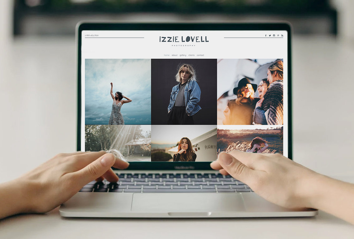
A website is a tool to curate content for your customers, make connections, and close sales. The navigation on your website acts as a guide for your website visitors, this includes both your top or main navigation menu as well as your footer. Your main navigation menu should be short, with six to eight items in the main navigation but that doesn’t mean your site should only have eight pages in total. You can also utilize your website footer (the bottom of your site) to create secondary navigation, plus more.
In this article, we’ll focus on how you can make the best use of your website’s footer to add value to your site.
Site Map
Built into each website is a code-based site map that is accessible to search engines to help them understand the organization of your website. You can create a similar map in your footer to help guide people through your site. It is a great way to list out links to the most important pages on the site.
It is helpful to organize links in your footer into categories with headers, like ‘Portfolio’ as a header for all your galleries (babies, families, portraits, weddings, events, fine arts, etc.).
Using your footer to list out links to key pages can make your website robust and informative. And it's ok to have links to pages in your footer that aren’t in your main navigation menu. For example, you may not include your FAQs page in your main menu, but it is a good idea to link to it in your footer.
As you consider how to use the footer of your website, think about what type of information you can display there and how to organize it, then you can build it up over time. I’d much rather see a dense footer than the main menu with tons of distracting drop-down menu options.
Badges and accolades
If you are part of any associations, groups, membership organizations, or have earned awards or accolades, the footer can be a smart area to highlight these on your website. What’s nice about showcasing these in your footer, is that they become a part of every page of your website.
Now, if you’ve won a lot of awards, you should be selective of what you include in your footer, and create a page on your website to display more. Also, if you won a special award 15 years ago, it might not belong in your footer but can still be part of your about or accomplishments page.
Pick the most recent and prestigious awards or memberships to highlight in your footer, and include a call to action to encourage people to follow a link to learn more about your accomplishments.
Sign up forms
Want people to sign up to learn more about special offers or recent news by email or text message? Your footer is a great place to include a newsletter signup form. You can add a form to the footer to collect this information (check out our newsletter form template, it is short and to the point). It should tell people what they are signing up for and collect their email addresses. It is important to keep forms in your footer concise so as to avoid crowding the footer.
A newsletter sign-up form allows you to collect emails to send updates to. The emails are stored in the contact section of the PhotoBiz platform, and with the help of tags, you can send targeted marketing campaigns to your contacts.
You can add tags to forms so that anyone who completes a specific form gets a specific tag added to their contact record. This can really help you learn where your sign-ups are coming from and what people’s interests are.
Contact details
Your contact information is one of the most important details you should include on your website, but you’d be surprised how many people forget to include it. The footer is a great place to display your contact details to help people quickly and easily access your location and phone number. If you have a form on your website for people to contact you, we also recommend including a link to that page in your footer.
One way to display your contact details in the footer is to create a category or column for contact options. You can include a link to your contact page, your address or an embedded google map, even a phone number (bonus points for making it clickable so people can tap to dial).
Having contact information in your footer does NOT replace the need for a contact page. It is just another quick and simple way to allow customers to see how to get in touch with you.
Social media sources
Lastly, your footer is also a great place to showcase where people can connect with you on social media. You can highlight this as other places to find you online or ways to connect.
Make sure that if you choose to highlight a social media channel in your footer, that you are active on it and it has content for people to engage with because displaying it may draw more people’s attention to it. And since those links go to external sources, we recommend having them open in a new window.
Now that you can see all the options you have for creating powerful and useful footers, give it a try. The most important thing is DON’T OVER DO IT. Sometimes people add too much content to a footer and it can quickly become a jumbled mess.
Keeping your footer clean and organized is key to helping people access your content and get in touch with you.
Need help setting up your footer? Check out these articles to get you started.
Want further assistance? Log in to chat with us or give us a call at 866.463.7620. We’ll be happy to help.


Leave a comment
0 Comments