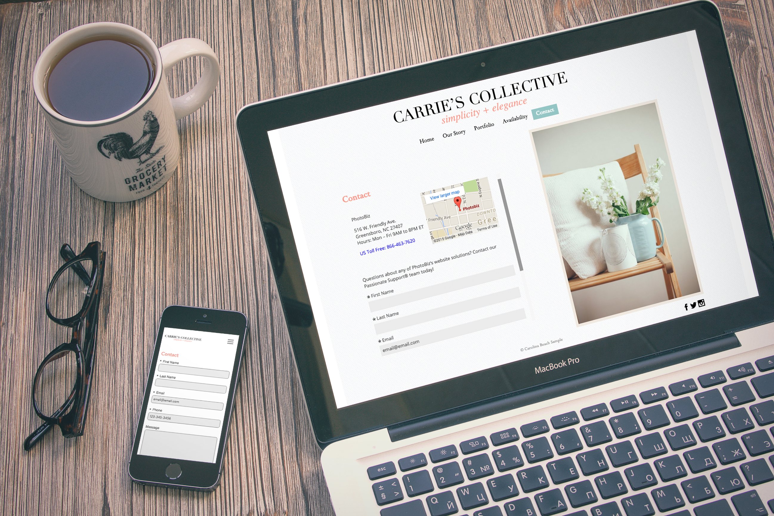
You may be surprised to know that your Contact page is typically one of the top 3 visited pages on your website. Yep, the little page that tells visitors where you're located, what your phone number is, and when you're open seems to be a popular destination for many website visitors. So if you know you have company coming over, don't you think it might be time to break out the fine china?
Don't worry...we're here to help you get your Contact page in tip-top shape. Lets take a look at the 5 must-haves for your Contact page:

1. Phone Number
As a business, you owe it to your customers to give them your number. If a potential client is browsing through your website and has a question to ask, it's only natural to pick up the phone and give the business a call. It may sound old fashioned, but trust us; in matters of business, hearing a friendly voice on the other end of a phone can set you apart in a good way.
Want to get extra fancy? Make your phone number clickable from a mobile device. (Sidenote: our Passionate Support team members are pros at this --- call them if you want some help!)

2. Email Address
Some visitors to your website are going to prefer digital communication. Provide an email address that is separate from your personal email so you can organize your business communications. If your business email address ends in @gmail, @yahoo, or anything other than @yourbusiness.com, it's time to graduate. It's super easy and inexpensive to have a branded email account. For people visiting your site, you come across as polished and credible. If you're a PhotoBiz client, Mailbox is the name of the game.

3. Location, Hours and Directions
If you have a physical location, it's critical to provide the address, hours you're open, and directions on how to get there. With mobile traffic making up as much as 70% of website visitors, you'll often have people visiting your website that are trying to find your business while they navigate to it. Providing directions can be as simple as typing out the routes from major roads nearby or embedding a clickable Google map (another specialty our team can help with!).

4. Form
If you have a contact form on your website that only asks for someone's name, email and message, it's time to spice things up a little. Think of what you want to know from someone who is contacting you, then tailor your contact form to make more sense for your business. Ask important questions like, "How did you hear about us?" and provide different selections for the person to choose from. I'm not saying to make the form long and difficult to fill out, however adding 3-5 questions to the usual name, phone number and email setup is perfectly O.K.

5. Image
It may seem funny that an image is one of the must-haves for your Contact page, but think about it: of all the things we've covered so far, are highly informational, presented as text or a form on the Contact page. By adding visual interest, you can make your contact page more engaging.
If you have a physical location, I usually recommend including a photo of your business. It will help those folks who are coming to your Contact page actually recognize your building when they are visit your "brick and mortar" storefront. If you work from home or in a shared space, use a photo of yourself. Any chance to help clients get to know you and your business is one you should take advantage of.

These 5 things don't seem too hard, right? The good thing --- our Passionate Support team can help you update your Contact page if you think it's time for a refresh.
Similarly, I encourage you to spruce up your "About" page as well. We already have a couple of resources helping you write the page, and show your personality as a business owner.


Leave a comment
0 Comments