We've covered "How To Write An 'About Me' Page" already. Now it's time to go beyond words and show your personality through the images you display on that page.
Here are 3 photo tricks to use if you want an about page that inspires clients to like and trust you.
1. PUT YOURSELF IN FRONT OF THE CAMERA
In talking with small business owners I've found that they are incredibly humble.
So humble, in fact, that putting themselves and their accomplishments at the forefront of their website can be a little intimidating. They put so much time and heart into their business and the different hats they wear to keep things up and running on a daily basis, that it's easy to forget who is responsible for the success of the business.
My advice - get in front of the camera and have some photos taken of yourself!
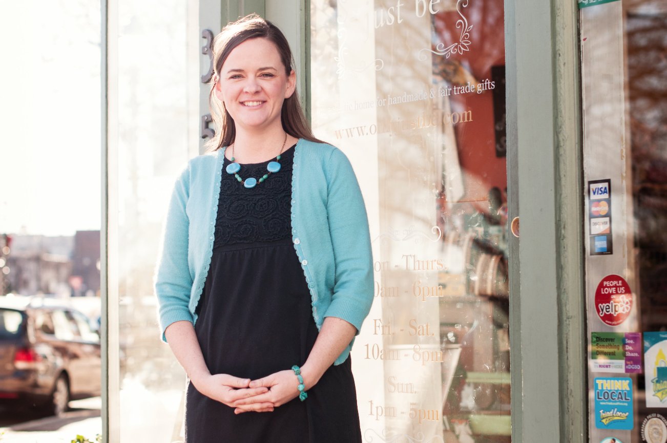
Another statement I hear from small business owners is "If I can just talk to someone...either face to face or on the phone, I can sell them whatever products or services I have to offer."
Here's the secret - your website can do this for you! If your personality shines through the images and words on your website, you're essentially having a virtual conversation with the visitors to your site.
2. BREAK THE "BUSINESS" MOLD
The word "business" can have a negative connotation in the minds of some clients.
When the "business" is paired with other words (i.e. business casual, business meeting, business lunch) there is an assumption that things will be more professional, but less personal.
As a small business clients choose you based on your personality and brand. So just because you're a business owner doesn't mean you have to be photographed in a business suit.
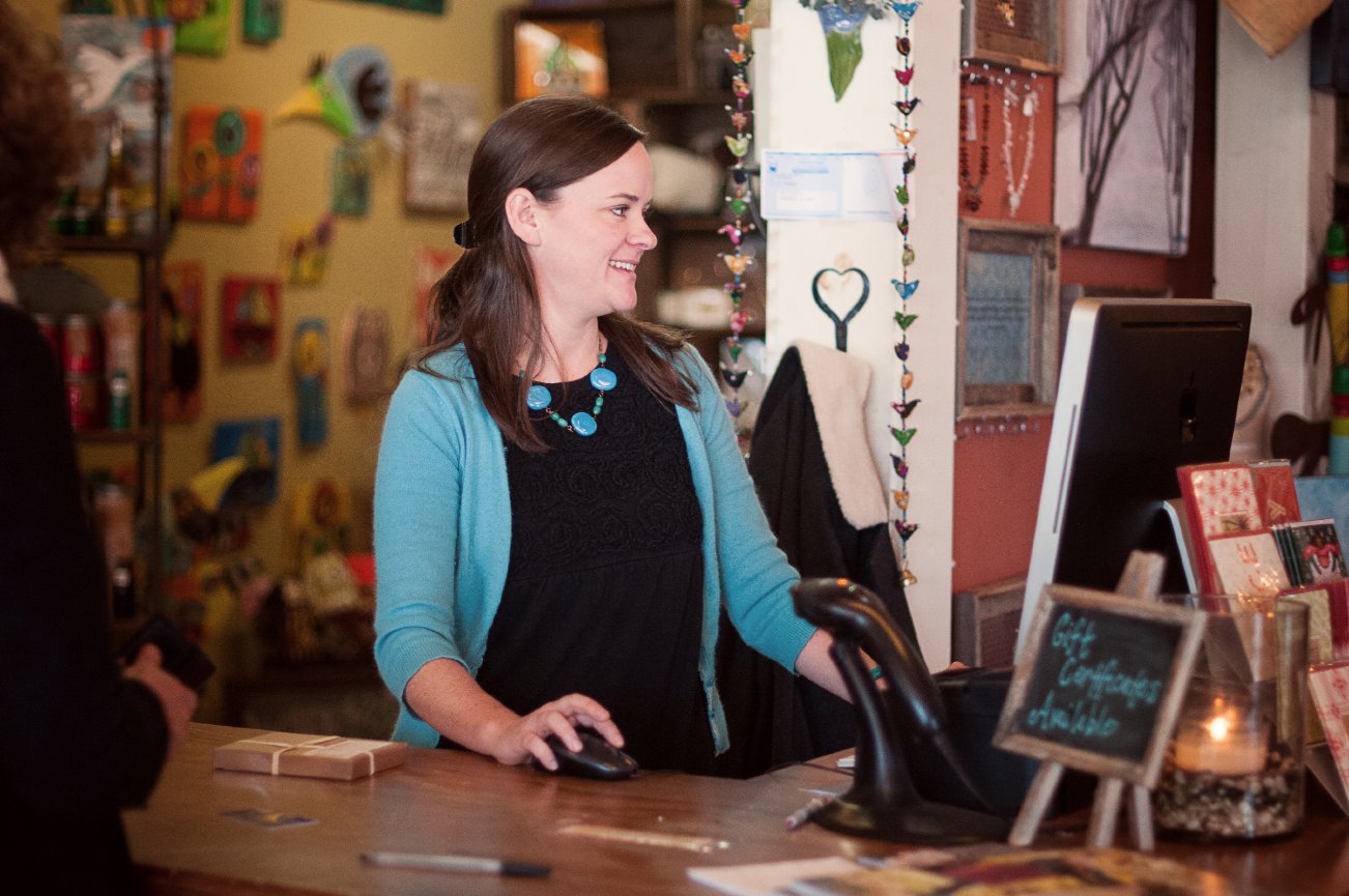
Relax a little and find a look that fits your brand. People want to see the genuine personalities of the companies they choose to work with.
Don't be afraid to show off your family, dog, or even favorite pair of jeans you always wear when painting your beautiful artwork. These things seem trivial, but can make someone feel like they know you before they ever have a face-to-face conversation with you.
3. GIVE YOUR PAGE A POLISHED LOOK
Once you have the perfect photos to use on your site, what comes next? Displaying them in a way that complements your style. Sometimes all it takes is a tweak here or there to go from "ugh" to "amazing!"
Choose layouts that pair your photos with your text in a way that allows visitors to get a fully personalized experience.
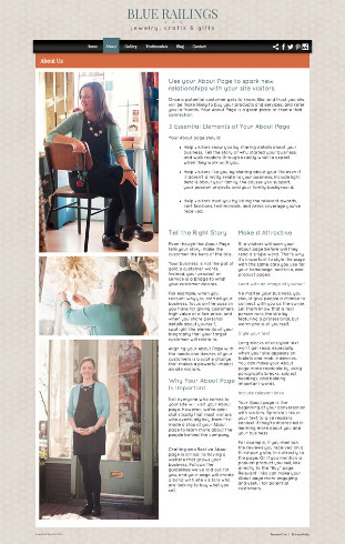
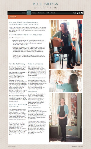
My suggestion would be to use one of our newest "About" page layouts: Stackable Left or Stackable Right. The images on the page stack on top of each other either on the left or right side of the text.
Take a look:
 |
|
 |
Ready to polish the look of your page? Dive into your PhotoBiz control panel and head over to your "About" page.
Want some help? Our Passionate Support Team can't wait to point you in the right direction. Give them a call!
Not a PhotoBiz customer yet? Call us and ask which of our website styles would fit your business.



Leave a comment
0 Comments