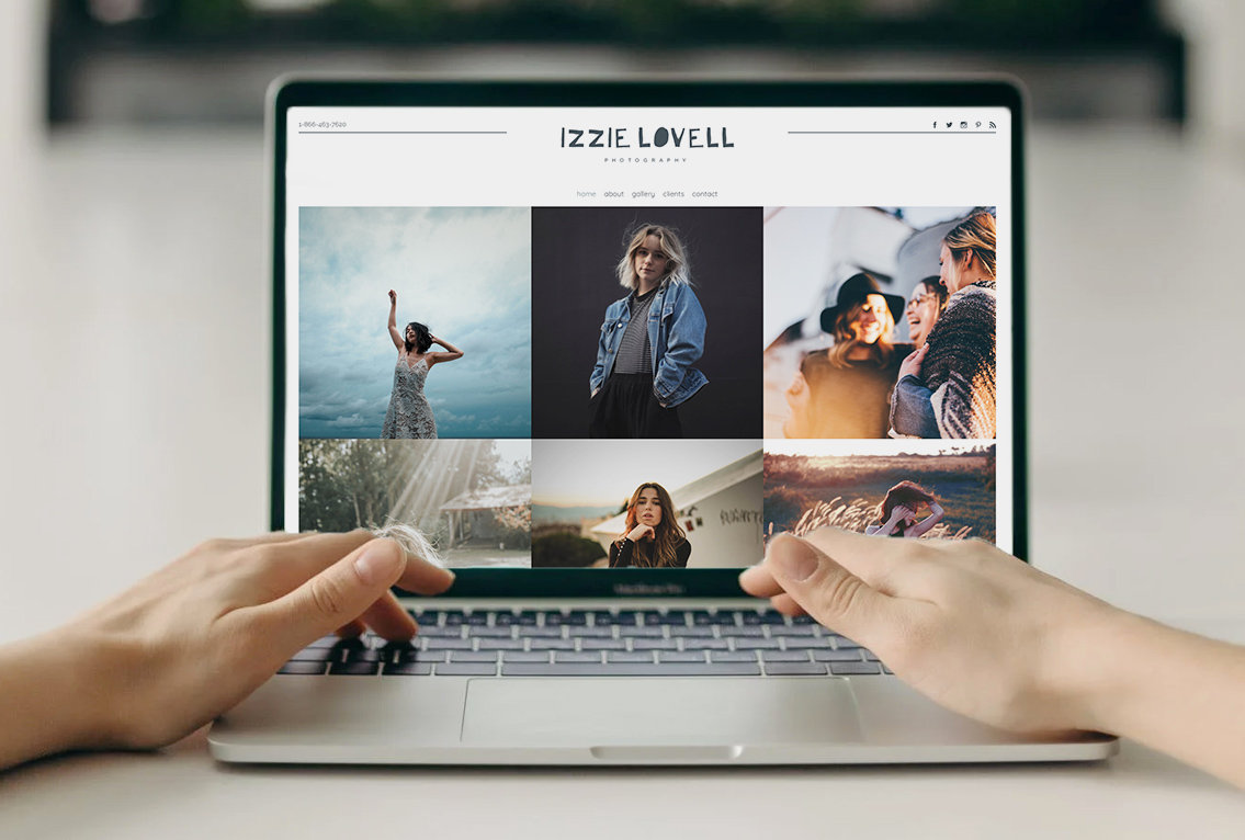
New today from PhotoBiz: an HTML5 website template that is simple, elegant, and perfect for showcasing large, beautiful photographs at full-width.
The template is called Seattle, and makes excellent use of a few new features to our platform: custom pages and FX banners.
Here are our favorite things about our new template, Seattle:
Scrolling Parallax "FX" Banners
I look at this template, and I feel like I’m window-shopping. Peeking through glass panes and keyholes into decadent, elegant shops and restaurants.
This isn’t a website, it's a window into another world.
There’s something so satisfying about scrolling through Seattle. I’m sliding, immersed. And the parallax feature isn't just for headers anymore. FX banners can be placed on any custom page – with words overlaid, too.
Just... delicious.
Slim, Sticky Menu
I’m in love with this lithe little menu. It’s compact and sticky, so it stays with you as you scroll; a friendly, unobtrusive guidepost.
Submenu handling is also classy and unusual, with drop-downs that carry all the way over to the right edge of the screen.
And it doesn’t disappear if your cursor slips off for a minute. Nice.
Prominent, Consistent Branding
Your logo is prominently displayed in the top center of every page, along with the page title.
Simple, consistent branding across your entire site.
Thank you to Cassandra Michelle for allowing us to use her absolutely gorgeous food & restaurant photography on the Seattle Sample.
I speak for the entire dev, design, and marketing teams when I say that we have been absolutely ravenous this week and it is 100% your fault. There are tooth marks on my keyboard from looking at this lobster roll :O


Leave a comment
0 Comments