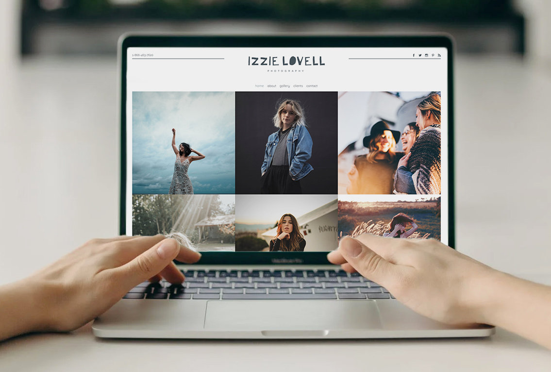
Your branding helps people identify who you are, and what makes you distinct. This includes your logo, colors, fonts, and more.
It is important that your branding represents and showcases your business. We’ve talked extensively about color theory for websites and for logos. Now we want to talk about how to set up your logo to look its best on your website.
In this guide, we’ll talk about how to make your logo look its best on a variety of our website template styles, how to utilize the global branding settings, and how you can customize your branding on individual products (for example if you want variation in how your logo looks on emails, invoices, and more).
Choosing a template: Will your logo fit?
When you’re designing a website, one of the first tasks is selecting a template. There are a number of aspects to consider when selecting a template, and one of them is how your logo will look.
Our website templates offer two main layout options for your logo — rectangular and square. As you consider website template options, how your logo looks in these orientations is important to keep in mind.
Narrow or rectangular logos
Rectangular logo designs work best on website templates with narrow (short) menu areas and left or right-aligned content. If you put a relatively square-shaped logo in this style of website template, the logo can often look too small for the space.
A rectangular logo design (that is wider or longer than it is tall) fills the space perfectly, allowing the rest of the website content to take shape around it.
The ideal size of your logo varies depending on which template you select. Use this sizing chart as a reference:
Larger or square logos
Larger, more square logo designs work best on website templates that feature the logo in the center of the menu. If you use a rectangular-shaped logo with these types of menus, depending on the parameters of the template your logo may appear smaller than ideal, as it is condensed to fit the square shape provided.
If you have a larger logo style, consider these website templates. They are organized into a sizing chart as a reference.
Uploading your logo to the branding section
Our global branding settings make it easy to use your logo across the whole platform of PhotoBiz tools in one sweep. You can upload your logo once and be done.
You also have the option to go through each tool in the PhotoBiz platform and add your logo in the branding section, as each tool has its own settings. This can be helpful if you want to use your logo in a different format on your website than in your emails or at the top of your invoices.
Check out this video to see how you can upload your logo to the global branding section in a matter of seconds.
FAQ
My logo looks too big. What can I do?
If you set up your logo, choose a template, and then feel your logo is displaying too large, you can add some spacing (or padding) around your logo and reupload it. It will then display smaller.
You can easily do this in Photoshop or Canva. Create a new file in the design tool of your choice with a transparent background, and set the size to the recommended specs for your website template (see above). Then insert your logo and allow 10-20 pixels of space between your logo and the edge of the design space (doesn’t have to be precise). Save/download your file, and then reupload it to the website branding section. Preview your website and continue to make adjustments until you get the logo displayed at your preferred size.
My logo looks too small. What can I do?
If you upload your logo, choose a template, and then feel it is displaying too small, you may need to remove some spacing (or padding) from around your logo. You can do this easily in Photoshop or Canva. Create a new file in the design tool of your choice with a transparent background, and set the size to the recommended specs of your website template (see above). Then insert your logo and use as much of the space as possible (while still showing your full logo). This will help remove the padding (empty space around your logo). Save/download your file, then reupload it to the website branding section. Preview your website and continue to make adjustments until you like the size your logo is displaying.
Why doesn’t the logo on my website match the one I put in the global branding section?
There are multiple places you can upload your logo including the global branding section and within each tool. If the logo isn’t appearing on your website the way you thought it would, you may have uploaded a logo in both the global branding section and in the website builder. Check the website builder branding settings to see if it is using your global or custom logo settings and make adjustments. Make sure to hit save changes after you adjust the settings.
Tip: If you're a current customer and migrated your website to PhotoBiz 8, your logo is automatically added to the website builder and the branding settings are set to custom. If you would rather use the logo in the global branding settings, just toggle to auto instead of custom, and click save.
It is exciting to get your website set up, especially to get your logo displaying how you want it. We hope these tips help. Check out our other helpful guides to building your website and using our tools.
Need a hand? Give our support team a call at 866.463.7620 or log in to chat with us.


Leave a comment
0 Comments