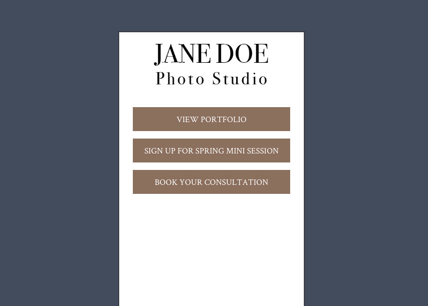
Trying to figure out how to spice up your email marketing? I’ll show you how to design an email in Photoshop and then slice it up into multiple images to use in our email marketing tool.
Before You Begin: You will need Photoshop and a basic skill level.
Set up a Photoshop document
Start with 980 pixels wide x 1500 pixels high at 150 dpi. You can always lengthen or shorten the document if you need to. We will be using "Save for Web" later. Setting it up at 150dpi makes the document larger and easier to see. I always start with a white background.
Place your logo
Place your logo at the top of the page.
Make a header
What’s your email about? Are you emailing your customers to let them know about Spring Mini Sessions? Or a Holiday promotion? Put that in large, bold type after your logo. You want your customers to know very quickly what your email is about.
Place your image(s)
If you want to use an image, put that next. You can place one image directly into the email marketing builder, or you could make it a little more interesting in photoshop. You could make it inset, give it a border, show three photos in a row, etc. I like to start with a solid shape and then convert it to a smart object (right click and Convert to Smart Object). Double click the square and then add your image.
Add your text
Add your text under your image. Maybe explain a little more about how your mini sessions work or the details of your holiday promo. How long does the promotion last? What's included? How much does it cost? You can do this in Photoshop or you can do it in the email marketing builder. I will usually lay it out in Photoshop and then copy and paste the text into the builder.
Call-to-Action
Here’s an important part you don’t want to forget. ALWAYS include a call to action. “Book Your Mini Session Now”, “Hurry, Limited Spots Available!", "Book Today” “Book Your Session”, you get the idea. I'm going to add a button in the email marketing builder, but you can always make a button in Photoshop if you want it to look different. Remember to update the link for the button.
Slice it up!
Now that your email is designed it’s time to slice it up! Make sure your rulers are turned on and drag down your horizontal guide line. I’ll usually do one section with the logo, another section with the header, image, button, etc. Not too big of a section because we want to keep each image under 250k (so the email will load faster). Don't forget to save your file (and it’s a good idea to do this a few times while you’re working on it).
Save out your images
Use the Rectangular Marquee tool to draw the shape of your first section (it should snap to your guide line) and then select the crop tool. Hit enter twice and you’ll just have an image of that section. File > Export > Save for Web will bring up a dialog box. Here you can check your JPG settings and make sure it’s under 250k. Save and name your file. Since this is the first banner, I’ll just label it SpringMiniSession-Banner1.jpg.
Once it's saved as a JPG you want to UNDO your cropping. You can use the key command or go to Edit > Step Backwards. Continue in the same manner until all of your sections are saved as JPGs. If you’re going to use live text for some blocks you can skip those. We’ll build them in the email marketing builder.
Build the email in your control panel
Log into your control panel and go to the Marketing tab. Hit the "New" button and pick the first template (it really doesn’t matter which one because we’re going to place in our images and change the colors).
Hit the cog circle and rename your email. I’m going to call this one "Spring Mini Sessions."
You can delete the logo banner – we’re going to upload the one we saved out from Photoshop. You can click on the first image you see or drag over a new image banner. Click Upload and navigate to where you saved the image banners and pop in your logo (don’t forget to link this to your homepage).
Continue the process until all your banners are uploaded. If you need a text box, go ahead and drag that over and add in your text.
If you’re not using a white background, you’ll want to go back into photoshop and eyedropper the color to get the HEX code (ex: #d9bc6e). Go back to your email marketing builder and hit the paintbrush circle. Enter the HEX code in one of the accent color boxes. Go back to the text box that needs the color background and you’ll be able to select the accent color.
Finish it up
If you’re using an image as a button to link to your call to action, make sure you put the link in when you upload the image. If you aren’t using an image as a button you can just use the button in the drag and drop builder.
If you want to change the background color of the whole email go back into the paintbrush circle and change it there.
That's it! You're done! Look at that beautiful email you just built! Go you!
TIPS!
- Double click the background layer and then draw a guide to the center of that layer. It’ll help you align everything in your document.
- If you’re struggling for a look or can’t pick out a font, download our FREE Social Media Templates or our FREE Price Sheet Templates. There are a bunch of great free fonts in there. And you can drag and drop pieces into your email template. (In my example I used the fonts and headline from the Price Sheet Templates).
- If you have Adobe Illustrator, you can also go to www.vecteezy.com to look for linear elements, banners, patterns, etc. to use in your emails. Sometimes I’ll make a cute header in Illustrator and just copy and paste it into Photoshop.
- Pay attention to emails you get from brands you like. Which emails do you open? Which ones do you read? What looks good? Keep that in mind when making your own emails.
- Struggling for a color palette? Pick one color you want to use (blue for example) and google “Blue Color Palette” and you’ll get a ton of ideas! If there’s one you like you can always open it up in Photoshop and eye dropper the exact colors you want.
- Don’t have a logo? We have a logo design service for only $250!


Leave a comment
5 Comments
Feb 2, 2022, 3:36:19 PM
PhotoBiz Growth Hub - You can set up any type of session with the scheduler, and even select it for a specific day to display the specific date of events, but we recommend using forms to create mini-sessions. The scheduler is better for longer-term arrangement booking, say throughout the week vs a single-day event.
But here are something you can look at to help set up mini sessions or create a limit schedule with the scheduler:
https://support.photobiz.com/blog-post/how-can-i-set-up-a-mini-session-sign-up-in-the-form-builder
https://blog.photobiz.com/growth-hub-blog-posts/how-to-use-photobiz-for-your-holiday-events
https://support.photobiz.com/scheduler/blog/how-to-set-up-a-new-service-for-the-scheduler
https://support.photobiz.com/blog-post/how-to-create-a-limited-schedule
Feb 2, 2022, 3:27:33 PM
Adriana Escalante Márquez - How can we setup mini sessions with scheduling?
Aug 24, 2020, 5:51:04 PM
Ignatious Kachingamire - Straight forward, thanks
Aug 4, 2018, 4:17:10 PM
Kim - This was so helpful! I just made one today and sent out an email campaign. Great tutorial and fun, too! Thank you for the incentive!
Jul 29, 2018, 10:24:18 AM
Rebekah Gregg - Thank you SO much for this tutorial! I’ve been wanting to know how to do this for awhile and I can’t wait to try my first one!