When building a portfolio website, what is the first thing you think of? Is it a slideshow of images? Is it a scrolling gallery of your best photos? With PhotoBiz, building a portfolio website is easier than ever. You can choose your favorite template and design a website that focuses on the visuals in your work by crafting pages that function differently from standard websites. In this guide, we’ll walk you through designing different elements of your portfolio website and how to make it truly shine.
A few things to remember when creating a portfolio website
First, what is a portfolio website? It's a simple website with galleries of your best images and important information to help audiences understand who you are as a professional photographer.
An important thing when creating a portfolio website is remembering to create static movement through the pages, or movement that doesn’t require scrolling. Incorporate images that move and rotate to maintain visitors' attention. Specific content may scroll, but the amount of content on the pages varies. These are some of the types of pages that we see on a portfolio-style website:
- Homepage or landing pages. These tend to be a gateway to your work, less conversational, and more attention-grabbing to point people to where they can learn more.
- Gallery pages. Focuses on highlighting your best work, these pages are largely images, displayed either as rotating banners or featuring scrolling options.
- About page. Provides a brief overview of your photography business and why someone should choose you to take their photographs.
- Booking or contact page. Encourages people to schedule or contact you via a form, you can easily put this page together in minutes.
Pro tip: When designing landing pages, consider turning off the footer and header of your website to keep people focused on the core content and calls to action on the page.
Splash introduction page
If you design a portfolio website, one thing you’ll notice is there tends to be less scrolling and less information on each page. A splash introduction page can lead visitors into a portfolio website, by providing specific doors to enter, such as different types of photography (e.g., senior, family, wedding, baby, fine art). It can be one large image or video taking over the screen with a call to action, split banners with calls to action, or simply rotating images. It should be skimmable so people will want to click through to continue viewing more of your work.
Let’s look at a few examples of effective splash pages.
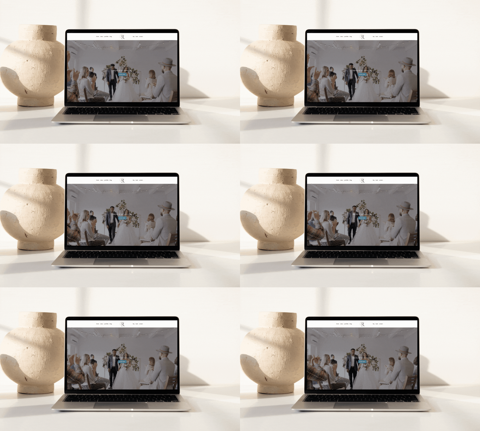
Full image splash page
This is the easiest one to achieve. With a banner block, you can add your favorite image to a new page, add a call to action, turn off the footer. And that’s it!
You also have the option to turn off the header. If you remove the header, we recommend adding a text overlay on the banner or a button below it to guide visitors to the other pages of your website.
Full video splash page
Want more movement? You can embed a video by using a video block and set it to loop so it continues to play. No audio should play, this a Google requirement, but it can make an impact for first-time visitors. You can also add headline text and a button to drive visitors deeper into your website.
On mobile, browsers disable auto video playback, so you can select a still image to display in the video's place.

Multiple image splash page
Want to direct people to multiple destinations from a single page? You can use an image block with multiple images (2-5) that represent your content and are linked to focused pages on your website. There are a few layout options you can select from, such as text overlapping the image, text underneath each image, and others with rollover effects. Select which you prefer.
Split banner splash page
A split banner page can add a professional touch to your website. This allows you to select two banner blocks and place them side-by-side. It works well to have one feature an image and the other feature a text call to action.
Start by adding the image you want to stand out on one side (with no text overlay). Then in the other banner block, you can upload one of the following two options and have text display on top:
- A preferred image that can act as a background image with a color overlay.
- A transparent image (like an empty .PNG file) to display a solid color background with the use of the color and opacity options.
You can create a visually stunning intro to your website with this layout option. For example, you can set one side of the banner to rotate while the side featuring a call to action remains static. You can use banners to create many different types of experiences for your website visitors.


Gallery pages for portfolio websites
Creating gallery pages is easy. The challenge can be selecting the right images to display. We recommend selecting 30-50 images to display on each gallery page of your website. This number is optimal for both mobile users and speed. Any more than that and most users have already made a decision.
You have a few options when it comes to the layout of the gallery pages on your website. To get started, add a new page and then add an image block. You’ll then be prompted to choose between these layout options:
- Non scrolling layouts. Your images will move and visitors can toggle between images but there is no vertical scroll on the page. If this is the style you like, select from these layouts:
- Gallery
- Slideshow
- Carousel
- Carousel Slideshow
- Scrolling Layouts. Your images will remain static and website visitors can scroll down the page to view more images. At a certain point visitors will be prompted with an option to load more images. Our scrolling layouts include:
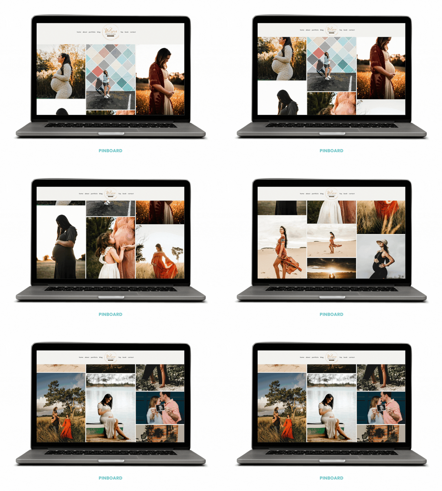
- Pinboard (images will display uncropped in a board layout)
- Square (all images will display as squares)
- Portrait (all images will display as vertical rectangles)
- Landscape (all images will display as horizontal rectangles)
- Collage 4, 5, or 6 (all images will display in a mixture of formats, you can choose how many images display in each row)
- Stack and Mini Stack (large single images display at a time for vertical scrolling like a film strip)

You get to select which layout is right for displaying images in your galleries. Each gallery can have the same layout or a different layout, it's your call. We are partial to the slideshow and pinboard layout options.
About page for portfolio websites
The About page might be one of the most straightforward pages on your website. It should help visitors learn the 5 W’s of your business – who, what, when, where, and why. This is a place to use text to describe your business and talk about the person/people behind the camera. People also want to see who is behind the camera, so be sure to include a picture of yourself/your team.
Booking and contact pages for portfolio websites
These pages are informational, like the About page. Start with a brief description and then provide a clear call to action, such as to book a session or contact you. You can use the PhotoBiz Scheduler to allow people to book a consultation or session directly on your website, or the PhotoBiz Form Builder to allow people to submit a request. If you have a studio location, your contact page should also include a map and parking tips. Whichever route you choose, keep it simple.
Pro tip: Use the PhotoBiz Scheduler to allow your clients to book appointments through your website.
Other pages to consider for your portfolio website
You can add as many pages as you like to your website, but less can be more and help keep your visitors focused.
Also keep in mind that not every page on your website needs to be in your navigation menu. You can create hidden pages that are only accessible after completing a form or are accessed through an ad or email campaign. We’ve seen hidden pages used to gather leads after people fill out a form to get pricing details or to share tips for preparing for a session (after it's booked).
It can also be helpful to include the following pages in your portfolio website navigation:
- Blog
- Client Galleries Log In
- Testimonials
Learn more about pages to consider for your website:
Hidden Pages: How and When to Use Them
PhotoBiz Scheduler Guide
Video Segment: The Value of Booking and Investment Pages
Will a portfolio website affect my SEO?
Even a portfolio website needs to have text to support the images you showcase, both to explain the services your business offers and for SEO. Without any accompanying text, visitors to your website (and search bots) may not fully understand what you offer.
You should use text to describe the services you offer, provide tips for successful sessions, and more. Another valuable SEO feature is alt tags for your images (which is important for accessibility). Plus a blog is a great way to add searchable content to your website.
By including a combination of text and images on your website, you'll be able to provide a more complete picture of your skills and experience to current and future clients, and by publishing blog posts you are also producing content you can share through social media channels.
Learn more about SEO:
SEO Topics
10 Tips for Simplifying SEO
7 Topics Photographers Can Use to Help Blog for SEO
Blogging for SEO: Use This Template
Adding Alt Text to Blog Post Images


Leave a comment
0 Comments