The week might be winding down, but we have exciting news that will turn your Friday into a Fri-YAY! Just released - new layouts for our Portfolio Sites!
We've had such a positive response to the layouts we released for our Blog Sites (square, pinboard, and flushed), that we added these beloved fan faves to our portfolio sites!
Enough of the reading already...lets get a visual!
Up first are the three new layouts for portfolio gallery pages. The home page of your website can now look like one of these three examples below. Additionally, use these layouts for your image galleries to get a fresh update to your site, without making major changes.
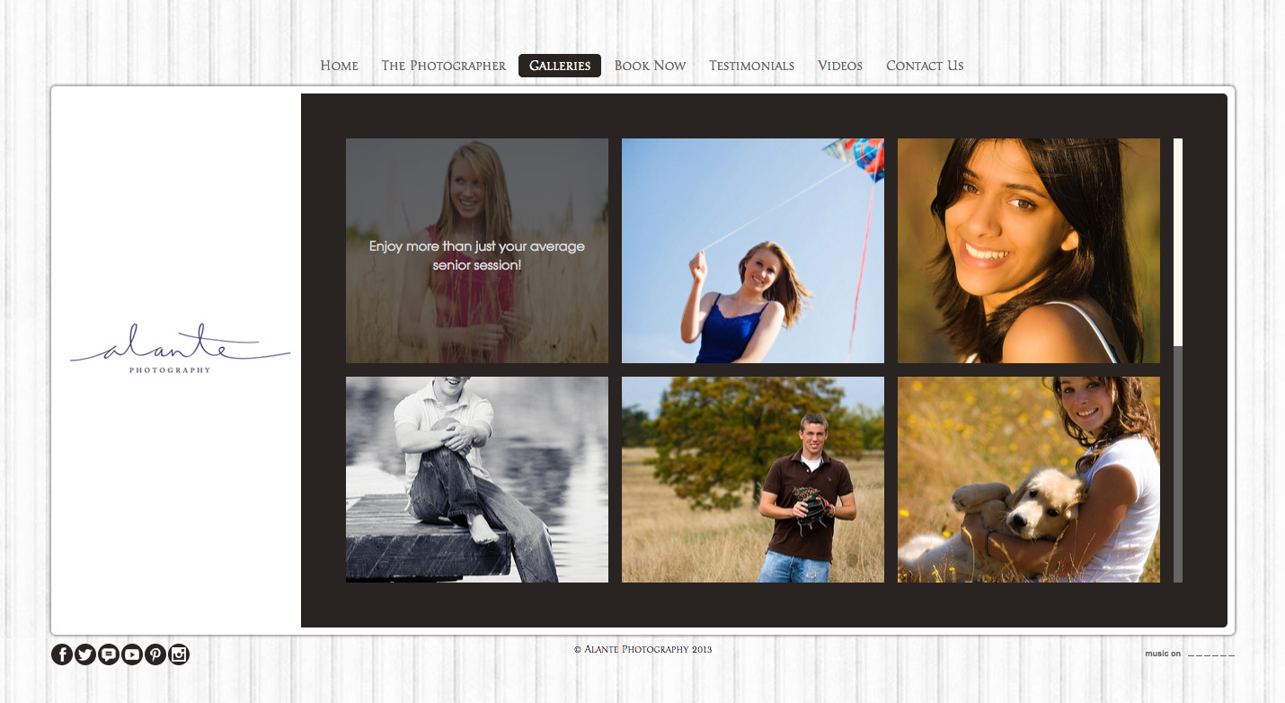
Flush 3
Images display as squares and are organized in rows of three. Captions appear when a mouse rolls over the image.
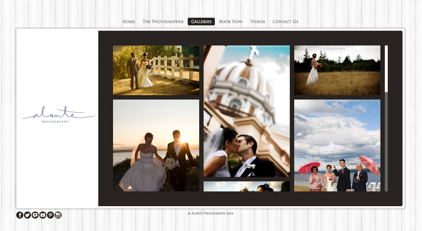
Pinboard Flush
Similar to Flush 3, you'll notice the images are organized in rows of three. However, with Pinboard Flush, the entire height of the image shows. This gives you a true "pinboard" style collage.
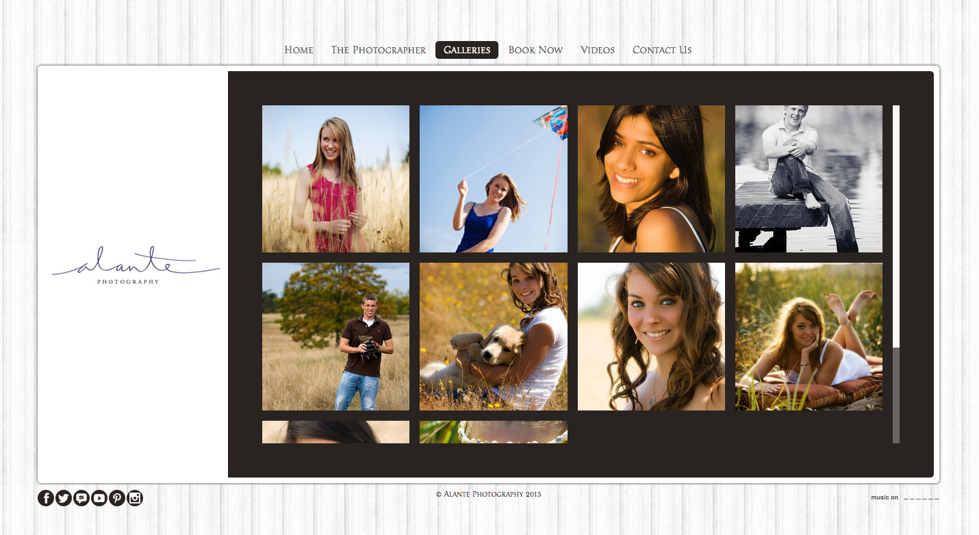
Square Flush
Square Flush arranges the images as squares in rows of four. Like the Flush 3 layout, captions appear when a mouse rolls over the image.
Gallery pages aren't the only ones that get to show off a new look. List pages have several new layouts as well!
As a refresher, list pages can be used in scenarios when you need an image to accompany a title and a small amount of copy. In real life, we see many clients use list pages for things like testimonials, links to affiliates, and showing a team of people. This is because you have the ability to include a title, description, and link to other pages of your site, videos, or outside sources.
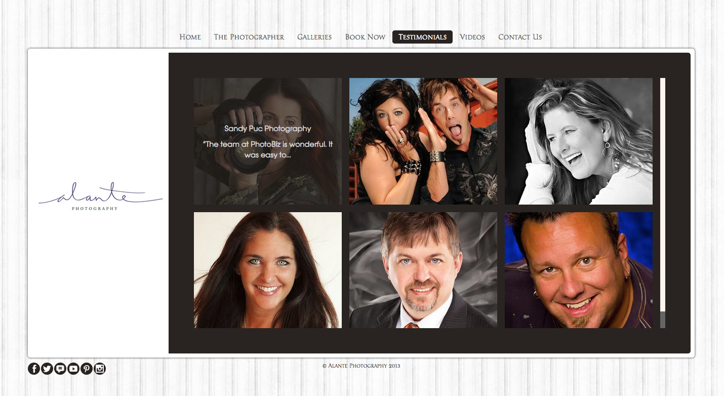
List Flushed 3
The list items are organized in rows of three, with a title and description text appearing when a mouse rolls over the image.
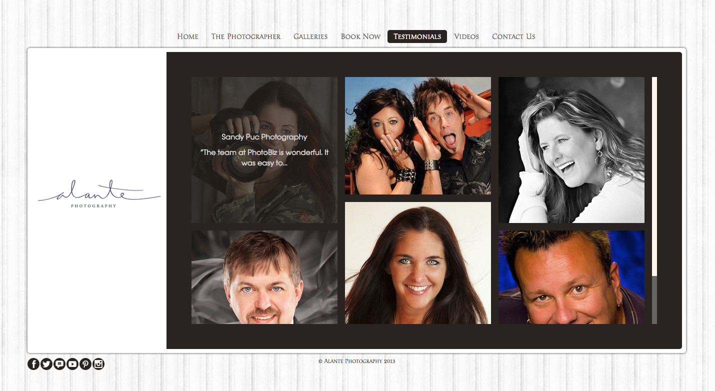
Pinboard Flush
This layout behaves the same as Flushed 3, but displays for the full height of the image. This way, you get the "newspaper" style of appearence when multiple images are uploaded with different heights.
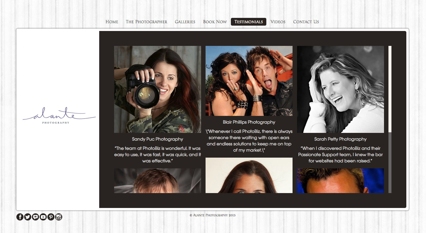
Pinboard
The Pinboard layout offers the same "newspaper" style as Pinboard Flush, but has the title and description under the image.
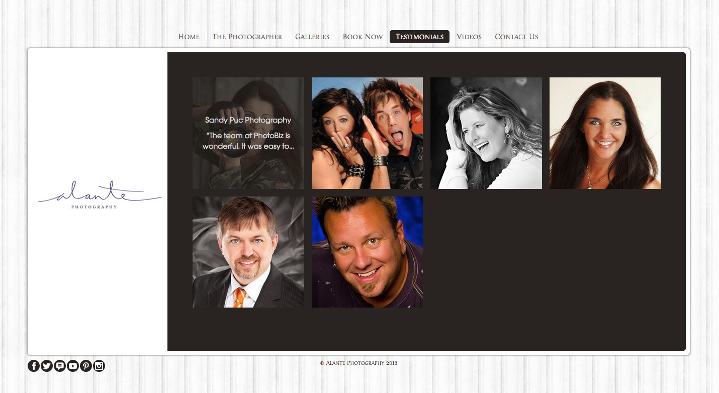
Square Flush
Square flush organizes the list items in rows of four, with a title a description text appreaing when a mouse rolls over the image.
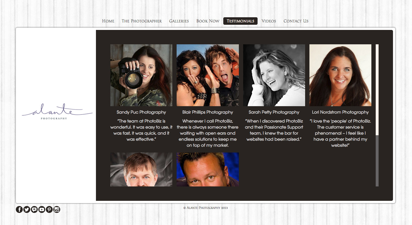
Square
Similar to the Square Flush layout, the Square layout organizes the list items in rows of four, with the title and description under the image.
A layout change is a great way to refresh the look of your website, without actually changing any content. With one click, you can change the layout of a page to one of these new options.
What are you waiting for?! Go give your site a new look!
If you need help, our Passionate Support team is standing by, ready to answer your call!





Leave a comment
0 Comments