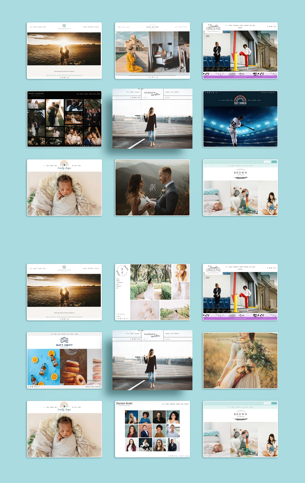
In today's digital age, having a visually appealing and user-friendly website is crucial for photographers to showcase their work and attract potential clients. PhotoBiz is a powerful all-in-one website platform designed specifically for photographers, offering an array of features and customization options. In this article, we will explore five essential tips that photographers should focus on to create an attractive website that will captivate current and potential clients.
Stunning visual design
First impressions matter, and your website's visual design sets the tone for your photography brand. With PhotoBiz, you have access to a number of customizable website templates, allowing you to create a website that reflects your unique style and showcase your best work.
Choose a clean and intuitive design that places the focus on your images. And opt for a consistent color palette that compliments your photography style.

You can design your website once and easily view how it looks on different devices using the control panel preview tools. You can also change the look of your website with a few clicks.
As you add pages to your website, you can choose from predesigned page layouts or start from scratch and build your own page(s). In no time, you’ll be quickly making updates, which will keep you agile for your clientele.

Learn more about design with these helpful resources:
Getting Started With PhotoBiz Guide
How to Design a Great Homepage
Global Settings vs. Block Settings — When to Modify Your Settings
What is a Website Template? A Break Down of How Website Templates Work
Showcase your portfolio
Your photography portfolio is the heart and soul of your website. PhotoBiz provides elegant and customizable galleries that allow you to showcase your work in a visually appealing manner. You can organize your images by categories or projects to help visitors easily navigate your portfolio. As you select images for your website, remember to curate your images to display your best and most representative work, ensuring that each image tells a compelling story.
Pro Tips:
- Less can mean more, so showcase your best, most recent photographs. All you need is 30–50 images per gallery.
- Update the images in your website galleries at least once a year to keep it fresh.
- Add written descriptions to your galleries. This is great for SEO and to make your galleries engaging.
Building your portfolio gallery? Check out these articles:
User-friendly navigation
A well-structured and easy-to-navigate website is essential for providing a seamless user experience. PhotoBiz’s Website Builder allows you to create simple navigation options. In addition to standard navigation menu options, you can create a drop-down menu for grouping like pages, choose to hide pages from the main navigation, and create a footer with intuitive navigation.
It’s important to create a clear and logical menu structure. So, keep your menu items simple and avoid overwhelming visitors with too many options. Incorporate breadcrumbs (links back up a level in your navigation menu), include a search bar, and offer secondary navigation menus to make it easy for visitors to find specific content or galleries.
Need some more in-depth tips on site navigation? Check out these resources:
Engaging about page
Your website's About page is an opportunity to connect with your audience on a personal level and establish a strong brand identity. It’s your “speed dating” page, to help a person get to know you in seconds. It is also a great way to reveal your intentions as a creative and humanize your brand to them. Use this page to share your story, your passion for photography, and what sets you apart from others in the field.
People want to see who is behind the camera, so incorporate high-quality images of yourself, your workspace, or behind-the-scenes shots to add a personal touch.
PhotoBiz makes it easy to customize your About page, so take advantage of this page type and make a lasting impression.
Working on your about page? Check out this article:
Contact and booking information
Converting leads into clients is the ultimate goal of your website, so make it easy for potential clients to get in touch with you by prominently displaying your contact information on every page of your website, including your email address, phone number, and social media links.
It’s also a great idea to include a contact page on your website. It should include a form to send you a message. PhotoBiz offers built-in contact forms, making it convenient for visitors to inquire about your services.
Beyond sharing your contact information, you can use your website to book clients using the Scheduler and/or forms. Making it easy for clients to book a time with you, can streamline your sales process.
Learn more about creating contact and booking pages:
MasterClass: Value of Booking & Investment Pages
5 Pages You Should Add to Your Photography Website
Creating an attractive and user-friendly photography website is crucial for establishing a strong online presence and attracting potential clients. By following these five tips, you can effectively showcase your work, engage with your audience, and provide an engaging experience. Remember to regularly update your website with fresh content and stay true to your unique photography style. With PhotoBiz, you have a powerful all-in-one website platform at your disposal to create a stunning online portfolio that will leave a lasting impression on your visitors.
Need help creating an attractive solution for your website? Contact our team by phone or live chat. We’ll be happy to help.


Leave a comment
0 Comments